Designing A Website Ten Years Ago
Envato CEO Collis Ta'eed reflects on how web design has changed since he co-founded the company.

Last month ten million people visited Envato Market, and a couple of hundred people worked on it. The toolchain looks like many other modern product floors — from Git to Invision and React to Sketch. But that’s not how that first iteration was done.
Ten years ago, I sat down to design the first Envato Marketplace: a site called FlashDen. I opened Photoshop and started a new canvas — a smidge smaller than the common screen size of the time – 1024×768. In client work I often had to go to the lowest common denominator of 800×600, but this was a site for a technical audience.
In planning how the site looked, it was really just about PC vs Mac, and Firefox vs IE. And the balance was firmly PC (almost 85% of our early traffic was Windows XP) and Firefox (two out of three users). The Nokia in my pocket certainly wasn’t a concern, Safari was a blip on the radar, and Chrome wasn’t a thing.
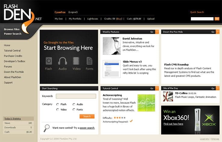
Visual style? It was all about the gradients. I was into the subtle ones, with just a touch of light in the background. Shadows helped too. A little later I wrote a popular tutorial about adding shadows and gradients to make visuals pop.
I even had the (foolish) audacity to call the post “Elements of Great Web Design”. Font choice was a darn sight narrower back then – I was super into Tahoma at the time, because even at 8pt with no aliasing it was readable and neat looking.
Page designs took the form of dozens of individual PSD files. There was a lot of USB wrangling to get them to someone, but in our case I was the front-end dev as well. So I coded those up for our Ruby dev, Ryan. He used to complain about my use of Dreamweaver’s code editor because the tabbing messed with Subversion’s ability to tell what had changed.
Mixed in with this, of course, was some Flash work. Back then, the gold standard of Flash site design was the appropriately named 2Advanced, and the awesomeness of their sites was matched only by the wait on their preloaders. But even though FlashDen was a site for trading Flash, we didn’t use it much.
Instead, the site was primarily HTML-based, and it was only the second website I ever built without a <table> based layout. (I only did that because Ryan got me a copy of Jeffrey Zeldman’s “Designing with Web Standards” and insisted I read it.)
I practised once on my own portfolio site and then built the front-end of FlashDen.
Like every other worker who was used to their tools, I was suspicious of how far I would get without tables, cells, rows and headers. It was swapping one type of wrangling for another in a world where browsers were still arguing over implementation.
When we launched FlashDen, our first month’s traffic was bolstered by the web galleries of the day, many of them created to promote web standards. CSSRemix, WebCreme, NetDiver, CSSMania, NewsToday — they all sent visitors.
Flash sites like Kirupa and Fcukstar sent us traffic too. Plus we got lots of traffic from a guy named Scott Wills who had a site that was home to a video that had gone viral on YouTube (some weird video sharing site that had started popping up).
However, much of our traffic was from search. And while we were past the bad old days of SEO where you loaded up keywords and weird out of place text, we still lived in the days where you could buy keyword links through mainstream services like Text-Link-Ads. It wasn’t for a couple more years before Google started cracking down on that practice.
Social wasn’t really a thing like it is today. There were discovery services like StumbleUpon, bookmarking like del.icio.us, and everyone was into customized homepages like NetVibes. But by and large traffic from social media was an afterthought. Besides I was pretty convinced that MySpace would crush that weird blue college site.
A Decade Later

Millions of users and ten years later, and everything is the same — but different. There’s still browsers and operating systems to worry about, just a more diverse set.
File transfer, collaboration tools, and the core creative and dev tools have all come leaps and bounds forward, as has the hardware we run it all on. A few technologies have died, and many have grown up.
The layers where people work have gotten deeper, and people have gotten more specialised. And reflected in that is the quality of the work being created in each space. Whether it is server-side or browser, design, dev or onsite marketing, UX or architecture, the whole set of professions has advanced.
Back in 2006, I thought that some of the practices of a decade earlier seemed amusing and quaint. I have no doubt that today’s designers and developers look back at ’06 the same way.
And as sure as you sit here reading this in 2026, you are going to have a giggle about today.
This article was originally written by Collis Ta’eed.
