Discover how the Japanese art of Wabi-Sabi could influence your design.


Wabi-Sabi is a Japanese aesthetic and philosophical tradition that centers around appreciation of the beauty of natural imperfection. Wabi-sabi reveres the flawed and impermanent in our environment and finds unexpected value there.
Wabi-sabi can be explained with this Japanese story:
A young man was asked to tend to a master’s garden. He worked carefully sweeping and raking the garden until it was orderly and just perfect. Before showing the garden to his master he shook a cherry tree, letting a few petals float randomly to the ground. Now the garden was beautiful.
Wabi-sabi is about accepting things as they are and knowing there will be imperfections, either in the moment or later, over time.
So, the garden was only perfect when it was imperfect—and that’s life.
There’s a crack in everything, that’s how the light gets in.
Leonard Cohen
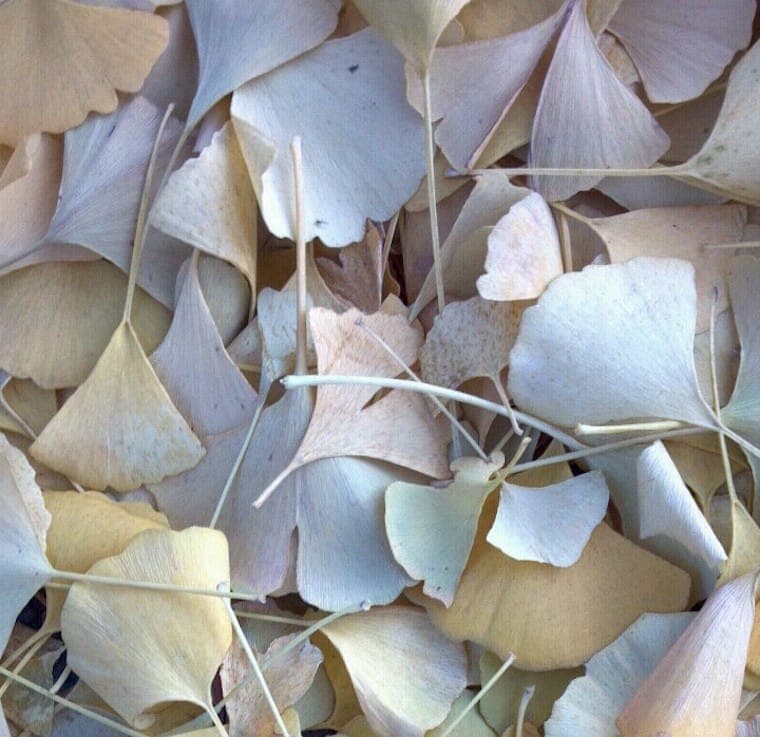
Wabi-sabi helps one to accept random imperfection and the natural and inevitable cycle of growth and decay.
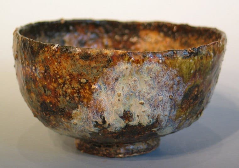
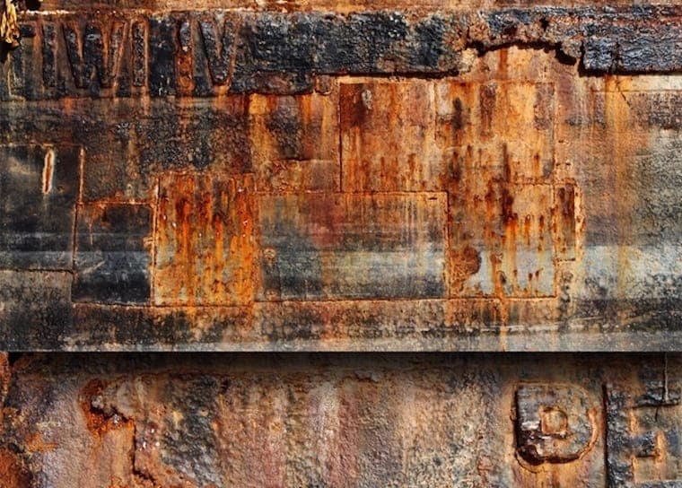
Wabi-Sabi actually is a two word combination. Wabi refers to the kind of beauty found in asymmetrical, uneven or unbalanced things. The asymmetry of a ceramic bowl is an example of wabi. Sabi is the beauty of aged things and speaks to the impermanence of life through the passage of time. An example of sabi is the lovely patina found on a rusted old metal wall.
Together the two words encapsulate much of the organic and natural beauty seen in the world around us. Torn posters on a city wall…the irregular texture of paint strokes down a wooden fence..moss on a rock.
As designers, we are often asked to create orderly things, like web and mobile interfaces or charts and diagrams. Digital design in particular has favored slick, modern and clean design.
However bringing a little wabi-sabi into design can infuse it with a little life, warm it up, and make it appear more real. Wabi-sabi beauty provides visual balance to projects since it’s basically the opposite of the polished digital screen-based design style.
One major way we see designers applying wabi-sabi to their projects is via textures. Textures can be used as overlays on text, as the background to banners and websites or as packaging for products.
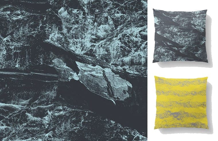
The Terrain digital art pack is a wabi-sabi tiling texture pack that can be applied in these ways. The pack includes designs created from a variety of land surfaces like rock, sand, dirt, and volcanic. Glaciers, mountains, tundras, deserts, rivers, valleys, ridges, watersheds and stream patterns are represented.
Wabi-sabi design elements can also make a project appear more hand-made.
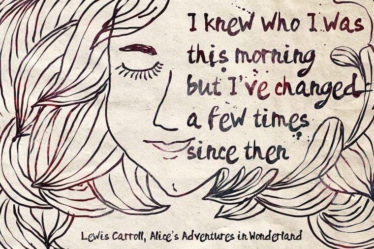
The Rainy Days Inkish typeface is a good example of a real-to-life font that could be applied to projects to give them a casual DIY look.
The letterpress print kit makes it possible to add all the gritty textural beauty of letterpress to design projects.
Adding wabi-sabi to a design can also make appear like a contemplative object or work of art.
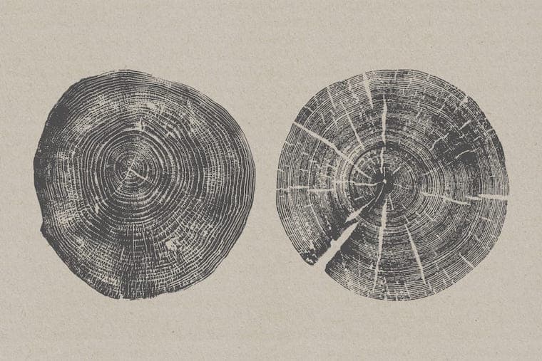
The Organic Textures set would look lovely as the central element on an art print or poster. The singular woodcuts are finely done, each ring and crack in the wood can be clearly detected.

Wabi-sabi elements can also make a design appear perfectly aged. The Lightleaks Vol. 2 20 Lightroom presets give photos a gorgeously bright sun-kissed look.
These are just some of the ways to add wabi-sabi design elements to projects. I hope you are inspired and feel free to explore your own ideas and approaches. The wabi-sabi aesthetic holds a world of examples and can be applied in a wide variety of ways, plus it never gets old.
Here are other photography articles to check out: