Discover the story of designer Paul Rand and the famous logos he created.


Perhaps more than any other designer in the 20th century, Paul Rand was responsible for defining the visual culture in America in the decades following World War II – and how we think about corporate logos today.
Learning By Doing
Born in Brooklyn in 1914, Rand was creative from a young age and practiced drawings as much as he could. His father wasn’t convinced his son could make a living with his art, but nevertheless agreed to let him attend night classes at Pratt Institute in Manhattan. Despite his years of study, Rand always maintained that he was self-taught. Later in his career, he said he “had literally learned nothing at Pratt; or whatever little I learned, I learned by doing myself.”
One of his first professional jobs was for Apparel Arts, a popular men’s fashion magazine owned by Esquire. He started out laying product spreads but it wasn’t long before he moved onto magazine covers.
European and Modernist Inspiration
Rand looked to Europe for inspiration and is regarded as one of the first American designers to do so. He was inspired by the commercial arts journals coming out of Britain and Germany, and learn about the works of Cassandre and Moholy-Nagy in copies of Gebrauchsgraphik.
He was a great admirer of Swiss Expressionist Paul Klee, and some of his early ads incorporated Klee-inspired drawings used as icons and symbols – unheard of at the time. Along with Modernist thinking on form and function coming out of the Bauhaus in Germany, all of these influences were reflected in Rand’s work, which often featured collages, montage, hand-lettering, photography and illustration.
By 1941 when Rand was just 27, he was appointed the chief art director of ad agency William H. Weintraub & Co. While advertising at that time had changed little in the 50 years prior, Rand went on to bring art into advertising, helping to shift the responsibility of designing ads from copywriters to art directors.
Reinventing the Corporate Logo
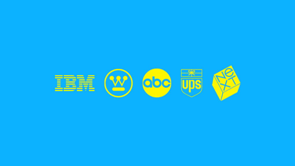
By the 1950s, Rand, moved on to what he is best known for – reinventing the corporate logo. He set the benchmark for corporate branding, most notably his designs for IBM, ABC, UPS, Westinghouse, Enron and NeXT.
Here are the stories behind some of his most famous logos.
01. IBM Logo
When Thomas Watson Jr inherited the reins of IBM from his father, one of his first tasks was to redesign the company’s logo. After seeing a store display for Olivetti typewriters in New York, the story goes that Watson Jr had an epiphany: “Good design is good business.”
It became the company’s mantra. Watson wanted to reinvent IBM’s image as a boring computer company into one with modern sensibilities, personality and character. He hired Elliot Noyes, a designer and curator for the Museum of Modern Art, to overhaul IBM’s design across the company. In turn, Noyes hired Paul Rand.
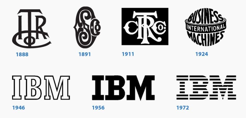
Working with IBM’s existing logo at the time, Rand’s first design was subtle. He replaced the font Beton with a similar but stronger-looking typeface called City, giving the letters “IBM” a more solid, grounded and balanced appearance. Rand also played with the shape of the letterforms, lengthening the serifs, and made the stacked squares in the letter “B” larger.
But Rand still wasn’t happy with the logo. It would take years before the detail-obsessed designer would figure out how to fix it.
“I felt there was a problem with the sequence, going from narrow to wide without any pause, without any rhythmic possibility,” Rand later said, explaining that he didn’t like the disparity in visual weight of the three letter.
In 1972, he finally introduced stripes to the logo to establish a better sense of unity and to suggest speed and dynamism. In the bottom left, two parallel lines form a sign of equality.
The IBM logo has remained unchanged ever since.
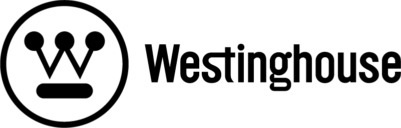
02. Westinghouse Logo
Established in 1886, electric company Westinghouse was a major conglomerate and General Electric’s main rival by the time it poached Elliot Noyes to work for them in 1959.
Noyes, understanding the need to revamp the ailing company’s visual identity, again turned to Rand. Earlier versions of Westinghouse’s logos featured the letter “W,” and Rand’s redesign didn’t stray far. He modernized the existing logo, creating a design that suggested the interlinked points of a circuit board.

Rand’s Westinghouse logo was launched in 1960 and to this day remains untouched.
03. American Broadcasting Corporation (ABC) Logo
During the first 20 years of the ABC’s existence, the network cycled through logos. The very first logo was inspired by radio. Basically, ABC took their radio network logo and slapped the letters “TV” on it. Then came a map of the United States, an eagle with a circle and the letters “ABC,” and then an unusual lowercase design, the “Circle A” logo. By the early 1960s, the network returned to its map of the U.S.
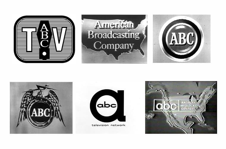
Paul Rand redesigned the logo, which debuted on televisions on October 19, 1962. Rand’s design, a black circle with white lowercase letters, retained the wordmark of the Circle A logo, but with a sans serif typeface.
While there have been updates to the logo in subsequent years, its simplicity and boldness have stayed true to the original design, standing the test of time. It was changed slightly in the mid-60s when colored television programming was introduced.
And again in 2007 to signal the arrival of HDTV.
04. UPS Logo
The UPS logo is hugely recognizable – who doesn’t know the shield?
It was introduced in 1916 after the company’s successful merger with a local competitor. The design featured an eagle holding a package against the backdrop of a shield, the shield being a traditional symbol of integrity and reliability.
In 1937, the logo was changed to reflect the company’s growth. The eagle was removed and the letters “UPS” were added to the shield.
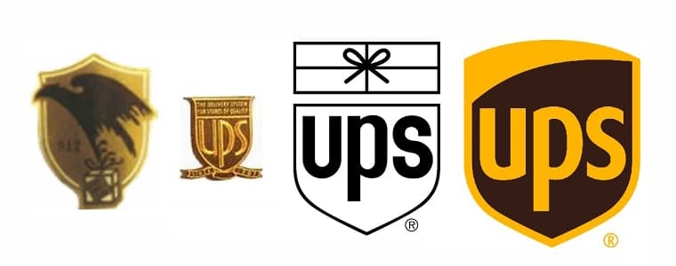
In 1961, the logo was redesigned again, this time by Paul Rand when he was hired to overhaul UPS’s visual identity. His design was a dramatic simplification of the existing logo, incorporating a bow-tied package above the familiar shield to express the company’s speciality, delivering packages.
So the story goes, Rand walked into the UPS head office and presented them with one design option. When asked if he had anything else, he replied, “That’s it.”
The logo remained unchanged until 2003. As part of a rebranding exercise, UPS updated the logo to remove the bowtie, reflecting the company’s expansion beyond just shipping and delivery services.
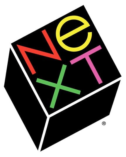
05. NeXT Computers Logo
After Steve Jobs was ousted from Apple, he moved on to NeXT, a computer company that developed and manufactured a series of computer workstations intended for the higher education and business markets.
At the suggestion of one of his employees, Jobs got in touch with Rand about designing the company’s logo. When they met, Steve didn’t give Rand much to work with. But what Rand did take away from the meeting was Jobs’s energy, enthusiasm and that he liked the playfulness of the Apple logo that Rob Janoff had designed in 1977.
Working with his initial impressions of Jobs and the only structural information he had about NeXT – that it would be housed in a cube – Rand embarked on a logical design process, which culminated in the final NeXT logo and a 100-page proposal book that walked Jobs through the conceptual process to the final outcome.
In a 1993 interview with Jobs, when he was asked what it was like to work with Rand, he said, “I asked him if he would come up with a few options, and he said, ‘No, I will solve your problem for you and you will pay me. You don’t have to use the solution. If you want options go talk to other people.’”
Rand was 72 when he designed the NeXT logo. He billed Jobs $100,000. Jobs was delighted with the work, even reproducing the concept book as a gift for others.
For more inspiration, check out our logo design guide or discover a selection of 50s logo designs.