

Clipping and masking is a feature of SVG that has the ability to fully or partially hide portions of an object through the use of simple or complex shapes. Over the years many developers have taken these abilities and pushed them in various directions. In this article we’ll take a look at some advanced methods along with demos that showcase clipping and masking to great effect. Let’s get started!
What is Clipping? What is Masking?
Let’s answer this question first: what’s the difference between clipping and masking? We’re going to take a look into each one in order to gain a better understanding. Be aware that while most features outlined in the specification work today, some will not. Always double-check caniuse as well as your own tests in the browser.
Clipping
A clipping path is an object where everything within the defined shape is visible, while the outside portion is “clipped out” and doesn’t appear on the canvas


In the sample image above, our shape (the Envato logo) is the object we’ll be using as our clip path object. The result is cut out from the solid background leaving only a hard shape in the form of our “clipping region”.
Masking
Here we take a graphical object or shape that will be painted onto the background through a mask, thus completely or partially masking out parts of the object.


Think of masks as a way to accept the visible region already defined by an object’s shape. In this scenario our mask is the object we desire to “extract” from our solid color background. The result is a shape that is identical to our mask (i.e. the solid black shape).
The Distinction
Still confused as to the difference? There’s a very subtle distinction between these two types of options. Think of a clipping path as a “hard mask” where the clipping object removed is a shape without any transparent or opaque pixels showing through. A mask consists of a shape or image where each pixel has varying degrees of transparency and opaqueness that can peer through, or hide portions in a very subtle fashion.
Now let’s discuss some elements and attributes which enable clipping and masking in SVG.
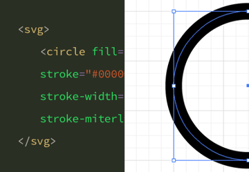
clipPath
An SVG clipPath accepts many attributes and content model types. The types of content models accepted are ones such as title, and description along with other types of meta data tags. It also accepts SMIL animation tags such as <animate>, <animateTransform>, SVG shapes (circle, rect, polygon, path) including <text>, <use>, style, and <script>. You can even have multiple clipPath definitions inside a parent clipPath.
Here’s a snippet using meta tags, SMIL and SVG shapes:
1 |
<svg viewBox="0 0 100 100" xmlns="https://www.w3.org/2000/svg" version="1.1"> |
2 |
<defs>
|
3 |
<clipPath id="my-clip"> |
4 |
<title>My Clip Path</title> |
5 |
<desc>an svg rectangle using a circle as the clipping target and animated with SMIL</desc> |
6 |
<rect x="0" y="0" width="200" height="600"> |
7 |
<animate attributeType="XML" |
8 |
attributeName="x" |
9 |
from=“-200" |
10 |
to=“400" |
11 |
dur="5s" |
12 |
repeatCount="indefinite"/> |
13 |
</rect>
|
14 |
</clipPath>
|
15 |
</defs>
|
16 |
|
17 |
<circle clip-path="url(#my-clip)" width="200" height="200" cx="50" r="50" cy="50" fill="green" /> |
18 |
</svg>
|
A clipPath created in SVG can also be referenced from CSS using the clip-path property like so:
1 |
.element { |
2 |
clip-path: url("#my-clip"); |
3 |
}
|
Here I’m referencing the clip from our prior SVG snippet with the url() function, and passing the id value of our clipPath. There’s also the option to use imagery as the target of a clipPath:
1 |
<svg viewBox="0 0 200 300"> |
2 |
<defs>
|
3 |
<clipPath id="clip"> |
4 |
<style>
|
5 |
circle {
|
6 |
fill: black; |
7 |
} |
8 |
</style>
|
9 |
<circle cx="100" cy="100" r="100"/> |
10 |
</clipPath>
|
11 |
</defs>
|
12 |
|
13 |
<image height="100%" preserveAspectRatio="xMinYMin slice" width"100%" xlink:href="https://images.unsplash.com/photo-1472195870936-d88b0d4c1b41?ixlib=rb-0.3.5&q=85&fm=jpg&crop=entropy&cs=srgb&ixid=eyJhcHBfaWQiOjE0NTg5fQ%3D%3D&s=f1abbd4d59a9b448813cb48769806ada" clip-path="url(#clip)" /> |
14 |
</svg>
|
The image in this snippet is using an SVG shape (circle) as its clipping object. The result is a circle with an image inside of it; pretty fancy eh? You may also notice the inclusion of the style tag within clipPath. Any <style> tags that are placed within clipPath (or a mask) will win out over any correlating attributes, and external CSS.
clipPath Attributes
There are several attributes clipPath can accept, and certainly too many to list. The specific clipPath attributes worthy of this article’s discussion are clipPathUnits and clip-rule. Here’s a run down describing what each one does, and how to choose the appropriate values.
clipPathUnits
This attribute is an extremely important one as it helps define the “coordinate system” or in other words “location” of clipPath contents. It accepts two types of values, but only one may be passed. By default userSpaceOnUse is chosen, and the one you’ll typically use.
-
userSpaceOnUseThe contents of theclipPathrepresent values in the current user coordinate system in place at the time when theclipPathelement is referenced, or in other words, the user coordinate system for the element referencing theclipPathvia theclip-pathproperty. -
objectBoundingBoxThe coordinate system has its origin at the top left corner of the bounding box of the element to which the clipping path applies, and the same width and height of this bounding box. User coordinates are sized equivalently to the CSSpxunit.
clip-rule
The clip-rule is another important attribute, but one that’s also fairly complicated to grasp properly, and falls under “presentation attributes” of clipPath. This attribute only applies to graphics elements that are contained within a clipPath element. When combined with the clip-path property, it defines what clip rule, or algorithm to use when filling the different parts of a graphic. It can also be achieved through the use of the fill-rule.
The clip-rule can be placed on a clipPath, referenced from within your CSS file, or inline SVG styles. The fill-rule can also be placed on the target of your clipping object, but the two options will have very different results.
-
nonzero: This value defines whether a point is inside or outside the path by drawing a line from a starting point to infinity in any direction, and counting the places where a shape segment crosses the line in a specific direction. When a segment crosses the line from left to right, the count is incremented; when a segment crosses the line from right to left, the count is decremented. If the count is zero, the point is outside; if non-zero, its inside. -
evenodd: This value defines whether a point is inside or outside the path by drawing a line from that point to infinity in any direction and counting the number of shape segments that the line crosses. If the count is odd, the point is inside; if even, the point is outside.
Mask
Mask can do a whole bunch of amazing things with imagery, shapes, borders, and positioning all through the use of <mask>. While it possesses the ability to be defined inside an SVG, it also can be referenced within CSS by way of the mask property. A mask can accept a clipPath, or another mask (hello inception). There are varying types of content models accepted and listed in their entirety from the W3C specification.
Here’s a code sample using SVG shapes as the masking objects, and targeting an inline SVG image.
1 |
<svg xmlns="http://www.w3.org/2000/svg" viewBox="0 0 100 100"> |
2 |
<defs>
|
3 |
<mask id="image-mask"> |
4 |
<circle id="outer" cx="50" cy="50" r="50" fill="white"/> |
5 |
<circle id="inner" cx="50" cy="50" r="25"/> |
6 |
</mask>
|
7 |
</defs>
|
8 |
<image width="100%" height="100%" preserveAspectRatio="xMidYMid slice" xlink:href="https://images.unsplash.com/photo-1472195870936-d88b0d4c1b41?ixlib=rb-0.3.5&q=85&fm=jpg&crop=entropy&cs=srgb&ixid=eyJhcHBfaWQiOjE0NTg5fQ%3D%3D&s=f1abbd4d59a9b448813cb48769806ada" mask="url(#image-mask)"></image> |
9 |
</svg>
|
This code sample results in a doughnut where the inner circle is transparent and the outer rim allows the image to show through. There’s a complete demo at the end of this article showcasing the result.
1 |
<svg xmlns="http://www.w3.org/2000/svg" viewBox="0 0 100 100"> |
2 |
<defs>
|
3 |
<mask id="SVGMask" mask-type="luminance" maskUnits="objectBoundingBox" maskContentUnits="objectBoundingBox"> |
4 |
<style>
|
5 |
#rect { |
6 |
mask-image: url(#SVGMask); |
7 |
mask-mode: luminance; |
8 |
}
|
9 |
</style>
|
10 |
<radialGradient id="radialFill"> |
11 |
<stop stop-color="white" offset="0"/> |
12 |
<stop stop-color="black" offset="1"/> |
13 |
</radialGradient>
|
14 |
<circle fill="url(#radialFill)" cx="0.5" cy="0.5" r="0.5"/> |
15 |
</mask>
|
16 |
</defs>
|
17 |
<rect id="rect" width="100" height="100" fill="green"/> |
18 |
</svg>
|
Here’s another code snippet where I use CSS properties as inline styles nested within mask to reference our masking object, and control the lighting mode using luminance (the intensity of light emitted from the surface).
mask-image
There are a couple ways authors can define a mask in SVG. The first is through the use of the SVG attribute mask="url(#id-value)" normally defined on the target within your SVG, and the other is mask-image.
Just like mask, the mask-image property accepts an identifier such as the value of the mask ID used in the code snippet above. If used within CSS you can reference the SVG file itself by way of the url function mask-image: url(your-external-file.svg#the-mask-id-value).
mask-mode
This property determines if the mask is treated as a luminance mask, or an alpha mask. A value of alpha controls the degree of transparency the mask allows, and a value of luminance controls the intensity of light emitted. If you decide to define this as an attribute on your SVG mask you can use the attribute mask-type directly on the SVG mask element, or you can also use mask-mode defined within CSS.
maskUnits
1 |
<mask maskUnits="[objectBoundingBox | userSpaceOnUse]"> |
Much like clipPathUnits, mask has a very similar attribute. This masking attribute helps define the coordinate system for attributes such as x, y, width and height. If no value is present a value of objectBoundingBox is used by default.
-
userSpaceOnUse: The user coordinate system for the element referencing the<mask> -
objectBoundingBox: A bounding box could be considered the same as if the content of the<mask>were bound to a “0 0 1 1” viewbox.
maskContentUnits
1 |
<mask maskContentUnits="[objectBoundingBox | userSpaceOnUse]"> |
Defines the coordinate system for the contents of the mask. Just like maskUnits, It also accepts userSpaceOnUse or objectBoundingBox as a value. If no value is passed then a value of userSpaceOnUse is used by default.
-
userSpaceOnUse: The user coordinate system for the element referencing<mask> -
objectBoundingBox: A bounding box could be considered the same as if the content of the<mask>were bound toviewbox="0 0 1 1".
Use Cases
There are some very clever ways you can implement masks and clip paths in your work today.
Demo 1
Here’s an example using a Slack-esque loading context where we give the user a feeling of perceived loading for content (hit rerun in the bottom right corner to see the effect).
Once the API data is obtained we can start to roll out out content. This is combining the use of CSS gradients, CSS animation, and SVG clipPath. Props to the original creator Yacine that sparked my updated demo above. I should point out that in order to go this direction you’ll need to recreate the placeholder look of your final product using an SVG editor such as Sketch to create the initial structure.
Demo 2
Here’s another clever and artistic approach, taken from a pen by Noel Delgado, showing hover events using SVG clipping:
While there is JavaScript being used to detect the mouse position, the effect itself is in fact an SVG clipPath. A wonderful effect for portfolio sections showcasing work, however make sure to create fallbacks for scenarios where a mouse isn’t present.
Demo 3
Sometimes simple is just as effective as complex. I’m a huge fan of typography and in this example by Steven Sinatra an SVG mask is used to help isolate the text and animate it in place (again, you’ll need to hit rerun). A fun approach that can be used for those well-known hero sections.
Demo 4
I chose this pen because it’s a really great use case for filling icons in situations such as ratings or liking posts/items, and it’s all done with an SVG mask.
Demo 5
Originally created by Dudley Storey, this fork by Shaw uses an SVG mask to isolate each skateboarder on hover. Using your mouse, hover over each one to see the effect take place. Pretty cool huh?
Want More?
How about something just for funzies? Movie posters just got cooler thanks to Chase. A really fun, and inventive example of SVG masks, and filters too!
I’ve also created a public demo containing further examples that show how to set up different types of clips and masks using a combination of scenarios, along with additional samples using SMIL.
Parting Thoughts
There you have it; a rundown and analysis of clipping and masking in SVG. Are you using these types of approaches in your work today? Have a really great use case demo to share, or just have an opinion about things in general? Post your comments below and happy coding!
Resources

 How to Hand Code SVG


 New Course: Switching From Font Icons to SVG


 SVG Brilliance: 10 Inspiring Examples From Around the Web


 SVG for Web Designers in 60 Seconds
- CSS Masking on W3C
- Synchronized Multimedia Integration Language (SMIL) on W3C
- The ‘animateTransform’ element on W3C
-
SVG on Envato Tuts+
- Animating Clipped Elements In SVG on Smashing Magazine
- Using SVG clip-path to change a logo's colour on scroll
-
Hover effects with SVG clipPath on tympanus.net


