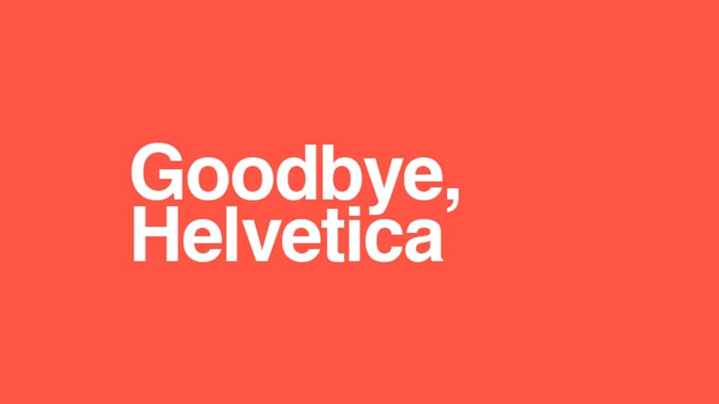
Why some big brands are ditching typefaces like Helvetica in favor of creating their own bespoke font.


Look familiar?
This is a font called Helvetica Neue. You’ve probably seen it before. Because, well, it’s everywhere.
No, seriously. Everywhere.
A few years ago a New York graphic designer tried to live for a day without seeing the font, and struggled to find clothes, transport, and even food that didn’t feature the typeface.
Popular with Madison Avenue in the 1960s, the font began popping up on products, signage, and more due to its neutrality, and readability. But in just the last few years, a not insignificant number of brands that used the font previously have switched typefaces.
What’s interesting is that you may not have noticed.
In 2011, Google switched to using an original font called Roboto.
In 2013, Apple switched to its own original font, San Francisco.
And, in 2016, CNN started using a new font CNN Sans.
What do these new fonts have in common? Well, to the lazy eye, they all look pretty similar to Helvetica.
In the last couple of years more brands have followed suit. Creating bespoke fonts built exclusively for them, including Coke, IBM, Netflix, and Airbnb.
But why?
What’s wrong with simple old Helvetica?
The story of Helvetica
According to Font Bureau, the story of Helvetica begins in 1956 at the Haas type foundry in Switzerland.
Haas was finding the sales of their sans serif, or grotesk typefaces were dwindling as the design world transitioned to the emerging international style.
Looking at its predecessors in the Haas type foundry lineup, you can see the resemblance to the font we use today.
Work on Helvetica began around 1956, comparing the most distinctive features of these old fellow grotesks: consistently horizontal stroke terminals, large x-height, and extremely tight spacing.
After debuting at “Graphic 57”, a trade show, Neue Haas Grotesk was an immediate success, soon adopted by many graphic designers. It became a hallmark of contemporary Swiss graphic design.
In 1959, seeing the opportunity for international expansion, Haas foundry made a deal with D. Stempel AG in Germany to manufacture the font for the Linotype machine, reaching an even larger customer base.
The name Neue Haas Grotesk was soon changed to something more reflective of both its geographic origins, and something a little easier to remember: “Helvetica”, a spin on the word “Helvetia” which is Latin for Switzerland.
As its popularity increased to unparalleled levels, Haas felt the demand to supply more weights, and alterations to the font. To do so quickly they hastily tweaked and renamed some older fonts in their library to build out the Helvetica family, and meet demand, which led to inconsistencies.
When Helvetica finally transitioned to digital, a lot of those inconsistencies came with it.
For instance, the Macintosh version of Helvetica Oblique still features a digitally slanted version of the font.
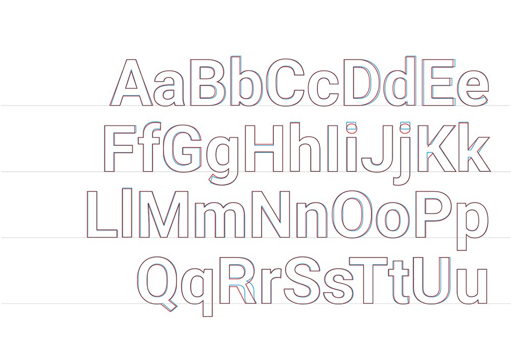
In 1982, Linotype set out to clean up this hodgepodge of fonts with a new family called Helvetica Neue.
Then in 2004 work began to digitize and “restore” this family, completed in 2010. Christian Schwartz who led the restoration carefully redrew the typeface to match its original forms drawn by Miedinger.
It provided all the weights from black to ultra thin.
And it’s this font much of the world uses some version of today.
But, over the last few years, we’ve started seeing less of it.
Bespoke Fonts
01. Roboto
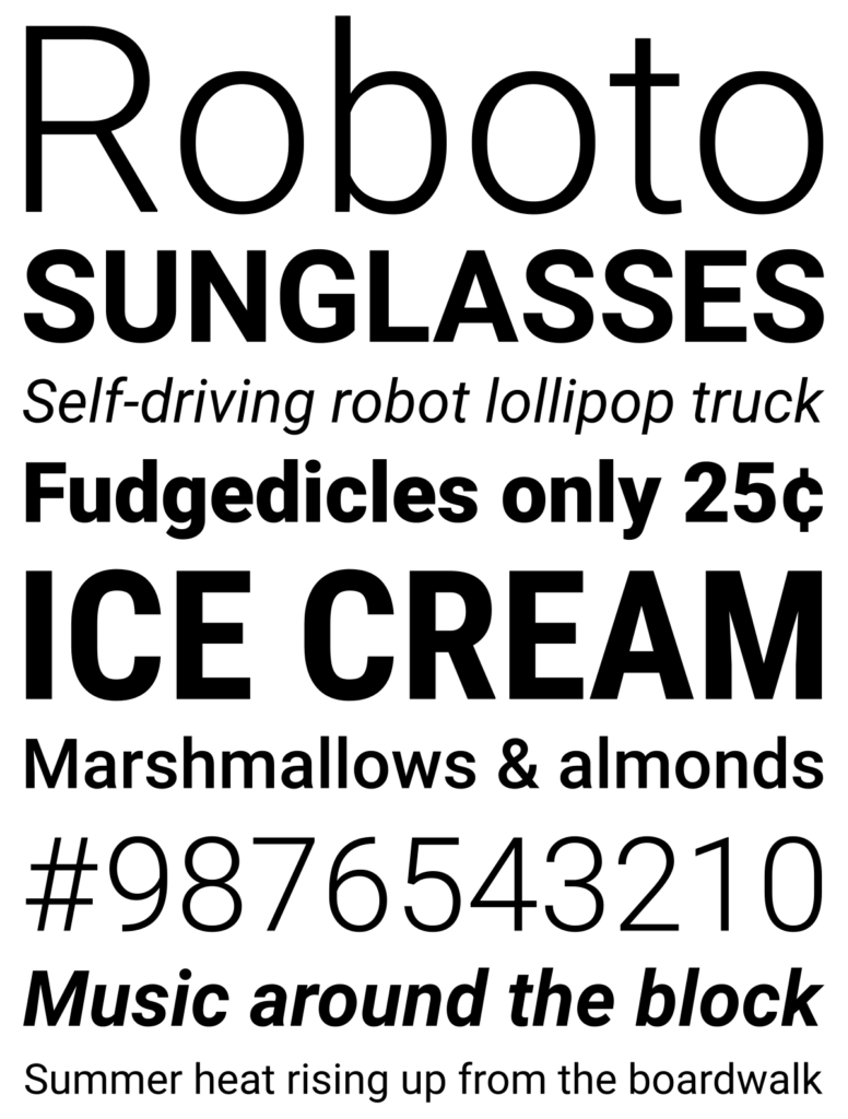
2011 saw the launch of Roboto, a neo-grotesque sans serif font described as “modern, yet approachable”, and, “emotional” by Google, the company that commissioned it.
It rolled out with that year’s update to Android.
Then, in 2014, paired with the launch of Google’s design language, Material Design, it updated the font to be more friendly, and perform well in a large range of contexts.
It uncurled the rounded leg of its uppercase ‘R’, and rounded the dots on its lowercase ‘i’ and ‘j’, along with its periods (.), and other symbols.
Now, it appears across most of Google’s products.
They’ve made it free to download making it easy for companies like Envato to use.
02. San Francisco
To go with its release of the Apple Watch, Apple developed a new font built for small screens called San Francisco.
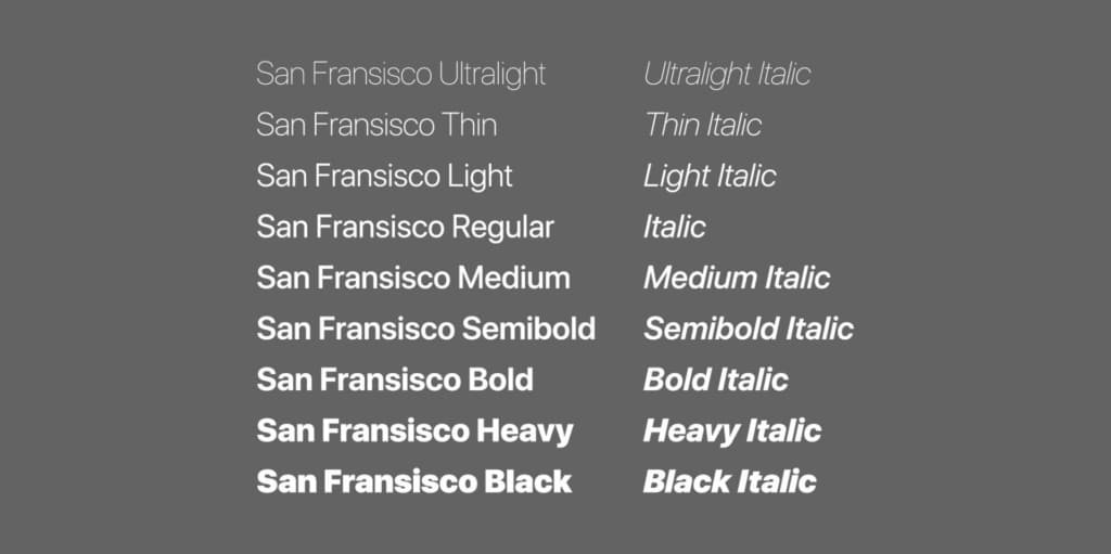
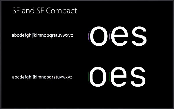
After using Helvetica Neue as the system font for the iPhone, iPad and Mac operating systems, they begun finding the font hard to read on small devices. Letters were blending together, the spacing was too close, and the font size and resolution was too low.
Two main versions of San Francisco are now in use: SF for iOS and MacOS, and SF Compact for the Apple Watch.
They’ve now rolled out the font across most of their software products too including Apple Music. It’s even in their logos for Apple Music and Apple Watch.
03. CNN Sans
In 2016, CNN unveiled a new brand font, CNN Sans.
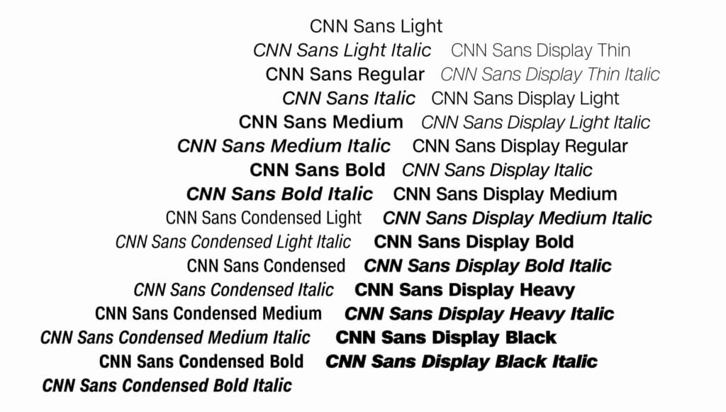
The first thing you’ll notice about the custom font is that it looks extremely similar to Helvetica. Which is something CNN doesn’t shy away from admitting. It’s an almost shameless modeling of it, offering the brand a lot of versatility to fit the various uses it had for it across its many platforms, TV, online, mobile, lower thirds, news tickers and more.
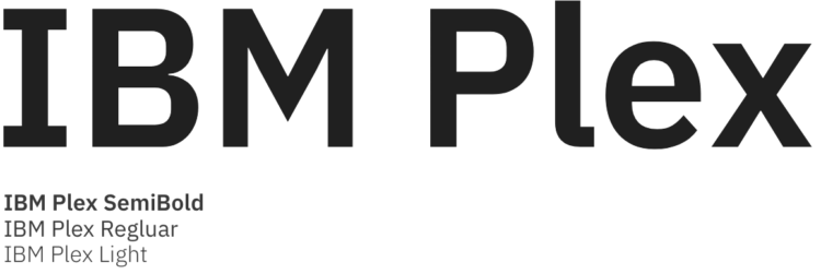
04. IBM Plex
At the end of 2017, IBM announced its new bespoke font, IBM Plex.
After using Helvetica, basically since it started making computers, the company decided it needed a font that felt more a part of their brand.
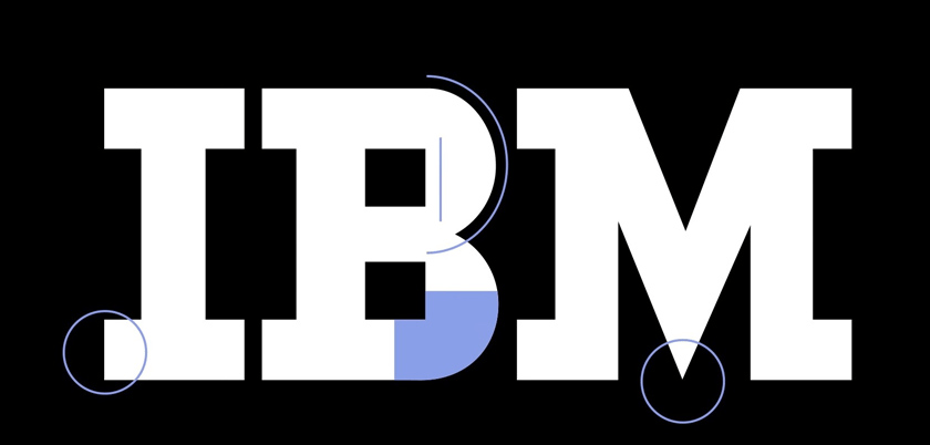
Drawing inspiration from the Paul Rand designed IBM logo, IBM Plex is clear, modern and playful – a characteristic that wasn’t always associated with big blue.
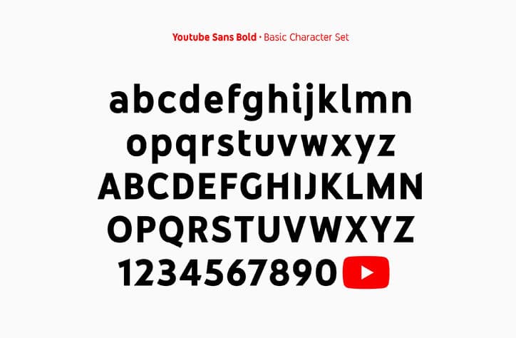
05. YouTube Sans
Inspired by its play button logo, which was refined along with the creation of this font, YouTube Sans was announced in 2017.
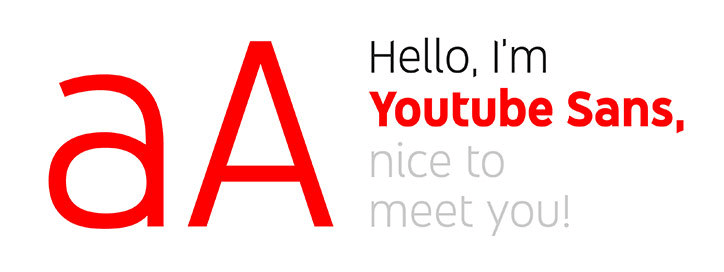
It’s a quirky font, designed to radiate YouTube’s bright and unique style. The lowercase ‘i’s and ‘l’s feature curves. The angled choppy ends of letters like the uppercase ‘H’ are cut in line with the angle of the logo’s play button. And the logo itself is a part of the font as a glyph.
The bespoke font is mostly used in YouTube’s marketing material, assets like PowerPoint presentations for its staff, and in certain parts of its interface.
05. TCCC Unity
In 2018, the Coca Cola Company announced a new bespoke font called TCCC Unity (the TCCC stands for “The Coca Cola Company”).
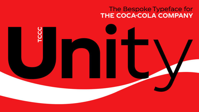
Designed by well regarded typographic agency, Brody Associates, it is described by the Coca Cola Company’s vice president of global design, James Sommerville as, encapsulating “Coca-Cola’s past and it’s American modernist heritage.”
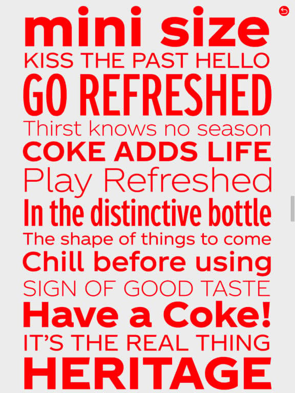
It’s a familiar and very friendly design, whose circularity makes it stand out.
Since then, Netflix, and Airbnb have also joined the pack, launching their own bespoke fonts.
Why Brands are Saying Goodbye to Helvetica
Why?
Well for one thing, the Helvetica family is expensive. A license to one of the world’s most popular fonts ain’t cheap. And when you’re looking at a company like IBM, for instance, who was licensing the font for its 380 thousand employees, those costs tend to add up. Compare that to the couple of million it takes to create your own font, to which you own the license to, and can roll out over everything from branding to PowerPoint presentations and business cards, it make a lot of sense to go bespoke.
But the other reason is branding.
The standards of fonts have changed. Just as the standards of brands have changed.
Big brands like these are no longer just experienced through their core products and marketing. They’re subservient to bloated expectations. They are present in completely different ways for their customers thanks to the internet.
Whether it’s a website or app experience, a video on YouTube, or an image on Instagram, every part of the experience with that brand is becoming an opportunity for them to communicate who they are.
Yet, while IBM, YouTube and Netflix have gone for fonts designed to at a glance contain their identifiable brand quirks, Apple, Google and CNN’s bespoke fonts seem remarkably demure.
Helvetica’s Legacy: Fonts
While each brand has its reasons for departing from using Helvetica, the world’s former favorite font can be sure it left its legacy.
Looking at Apple, Google, CNN, and Netflix’s fonts, for the most part they’ve tried to create something minimal, elegant, and functional, characteristics Helvetica in many ways made desirable.
They wanted a Helvetica of their own.
1. Abside by hederaedesign


A modern angular typeface, Abside by hederaedesign focuses on clarity and minimalism. It’s clear to read, even from a distance, thanks to its spacing and the simplicity in each letter’s shape. But its also easy on the eye thanks to the subtle rounded edges of each letter.

2. Metrisch by formikalabs


Including seven weights, plus italics in each weight, Metrisch by formikalabs is based on traditional geometric construction, with its letter size wider and x-heights taller than average. It features clean vertical cuts on the terminals, and sharp corners that strike a balance that is smooth and refined.
The weights range from extra light to extra bold. It can make for a great logo or headline, as much as it can work well as a body font.

3. Alma Mono by dafeld


Alma Mono by dafeld is striking. It comes in five different weights, looking stunning in both extra light and extra heavy renders. Its rounded corners give it a soft, friendly feel. While the stark simplicity of each letter’s shape makes the font look minimalistic and modern.

4. Reef – Round Font by WildOnes


Reef is a simple sans-serif font. Its rounded corners and terminals make it appear smooth and clear. And each letter is contained in a small amount of space, making it great for fitting lots of content on a small screen.
It’s a distinctive font that would work well in logos and headings.

5. Frank by dafeld


Inspired by classic fonts like DIN, Eurostile and Futura, Frank is perfect for the 21st century. With characters that suit a wide array of languages, and its unapologetically clear and, if you will, frank design, it’s distinctive and functional.

6. Martian B by crftsco


Inspired by industrial signs, Martian B by crftsco is tidy and straightforward. Available in nine weights from thin to extra black, it’s perfect for signs, logos and headings. It’s strikingly modern, featuring purposeful curves within this mostly rectangular font.

7. Cebo Font by khurasan


Beautiful and minimal, Cebo Font by khurasan includes a number of different weights and an option with a drop shadow. It’s a great logo typeface for brands wanting to look extremely modern and futuristic.

8. Larizo Script Font by letterhend
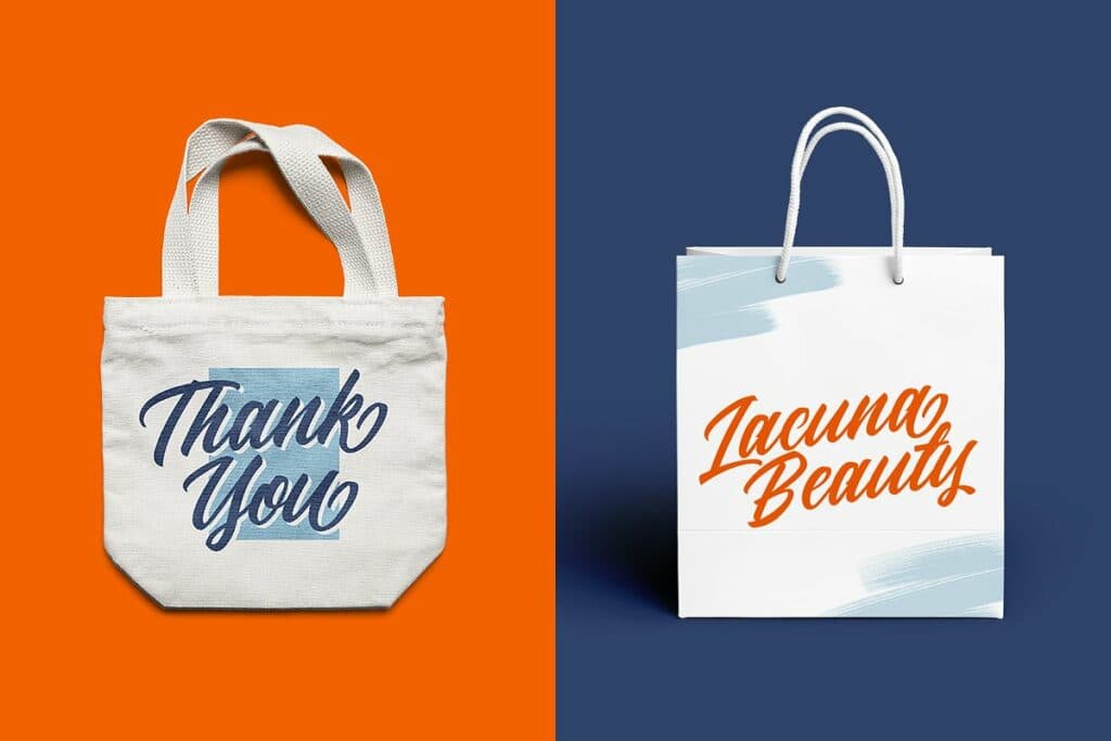
Script fonts are rising in popularity for some brands. And while it won’t suit all types of content, it’s great for headlines, slogans, logos and simple marketing messages. It will give things a personal touch.
10 Ready Handwritten Font by sunnytudu
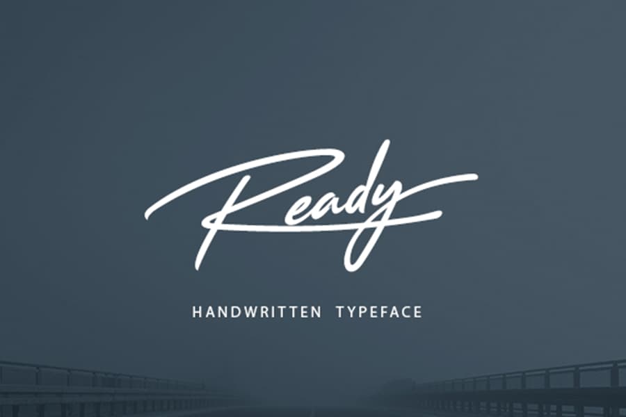
Another handwritten style of font, Ready by sunnytudu feels really modern and clean, two words not always associated with script typography. Each stroke making up the letters feels purposeful, but the narrow flicks like on the capital ‘F’, or between the two stems of the capital ‘H’, and the area on the lowercase ‘a’ where it looks like the marker has brushed past, give it an authenticity that’s impressive.
11. Glorynight Tall Ver by yipianesia


A great display sans font, Glorynight Tall by yipianesia follows the octagonal form principle. It’s built to stand out and make a forceful impression. It’s great if you’re looking for something punchy and modern.

12. Skylight Graffiti by RVQ
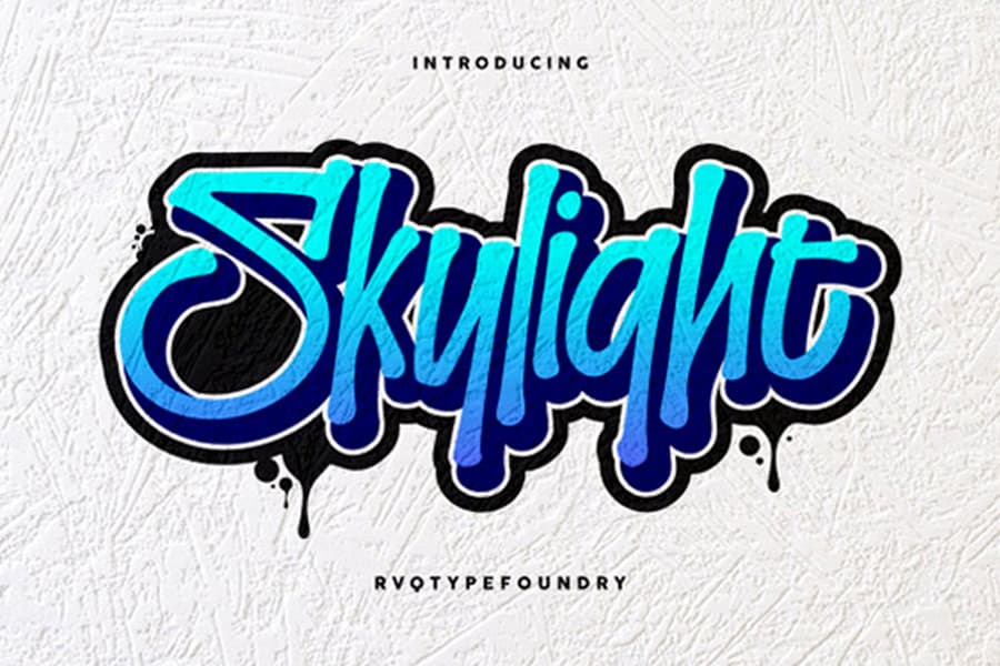
Turn that cap backwards and try and appeal to the youth demographic with this graffiti inspired font. Skylight Graffiti by RVQ is a clean, modern looking script font that feels fresh. Create a distinctive logo, or share brand slogans with a font that will be sure to catch the eye.
13. Porter Font by fhemmekam
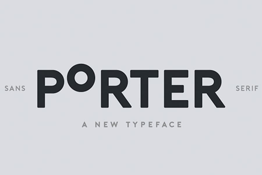
Porter is a beautiful sans-serif font that comes in three weights and matching italics. While it’s extremely sleek and modern, the roundness of some characters and even proportions of each letter make it feel simple and friendly.
14. Amber Queen – Signature Font by maulanacreative


Make your logo or marketing material look not only like you’ve written it with a market, but also, that you have beautiful handwriting with Amber Queen – Signature Font by maulanacreative. Its weight is elegantly narrow, its capital letters are slim and tall, and the cursive letters are clear and tidy.

15. Astronout Signature Typeface by maulanacreative


And finally, if your brand is all class, Astronout Signature by maulanacreative could be perfect for you. Aiming to give off the handcrafted feel of a signature, the typeface is well suited to stationary, logos and more.
I can picture using this on the poster for a cabaret at the Carlyle Hotel in New York. I’ll be sure to let you know where to get tickets.

Whether it be because they look good on all sizes of screen, can be exclusively associated specific brands, or companies from paying yearly licensing fees, some of the biggest brands in the world are adopting bespoke fonts.
And although Helvetica is far from broken, typefaces specifically built for this moment in digital design are gaining popularity, and could become a standard part of branding.
We’ll be watching to see if this trend continues as the year unfolds.