Here are useful ideas to help you design page layouts, organize product grids, and most importantly guide visitors through the product sorting process.


Every eCommerce product page typically uses a grid and custom sorting. This makes the browsing experience a whole lot better and gives visitors more control over the shopping experience. But there are so many different ways to create sorting features; you may not know where to start.
In this post, I’ve taken a look at the latest trends for custom UI/UX sorting features. You’ll find great ideas to help you design page layouts, organize product grids, and most importantly guide visitors through the sorting process.
None of these features are inherently right or wrong. They all work well, but they fit into different layouts and cater to different shopping experiences.
Custom Sorting UIs
The best product sorting features always take into account product variety and user experience. This means you should always offer the most valuable options for sorting while also creating an interface that’s usable and easy for the user to learn.
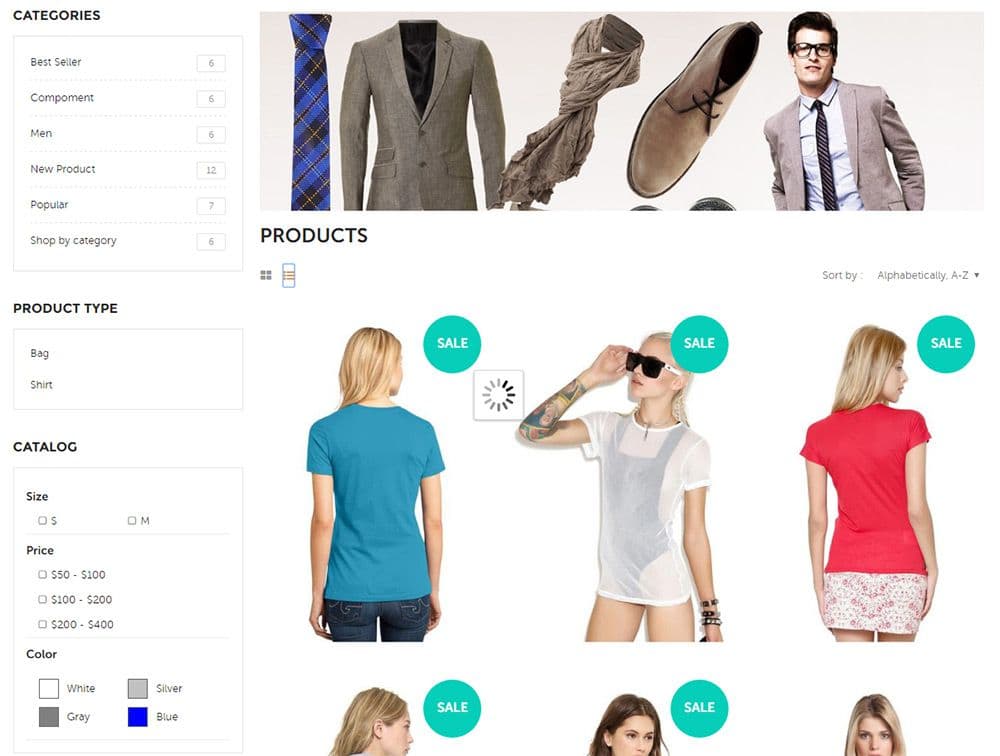
Two standard display options are list view and grid view. These are usually denoted by small icons above the products list that allows visitors to switch between products in grid or list format. By default, the grid fits more products on the page. But it’s always a good idea to let the visitor decide what they want.
Check out the this demo for a live example.
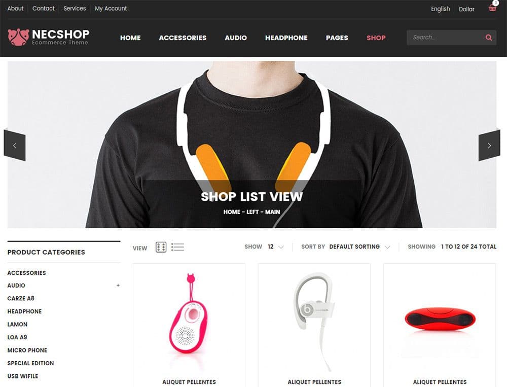
Right above the products listing you’ll see a label for “view” with two icons. The dot grid icon symbolizes the default grid layout while the icon with rows symbolizes product lists.
Almost every eCommerce layout has the option to switch between list and grid view. It’s such a basic feature, yet crucial when browsing through a big catalog of items.
But notice the other interface elements along that same row. You can change sorting features by the total number of items and the sorting style. Default is alphabetical, but you can change this to either most popular items, most recent items, or cheapest/priciest items.
Think beyond what features you’re offering to also consider the design itself. Are the sorting options easy to use? Are they intuitive?
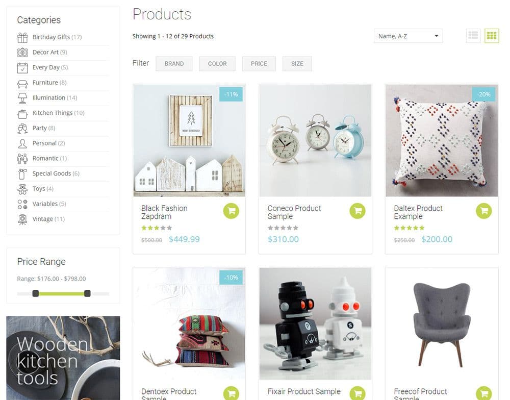
Take a look at this material design shop with minimalist labels for sorting. Everything blends into the design so that the interfaces don’t jump out, but also don’t feel hidden either.
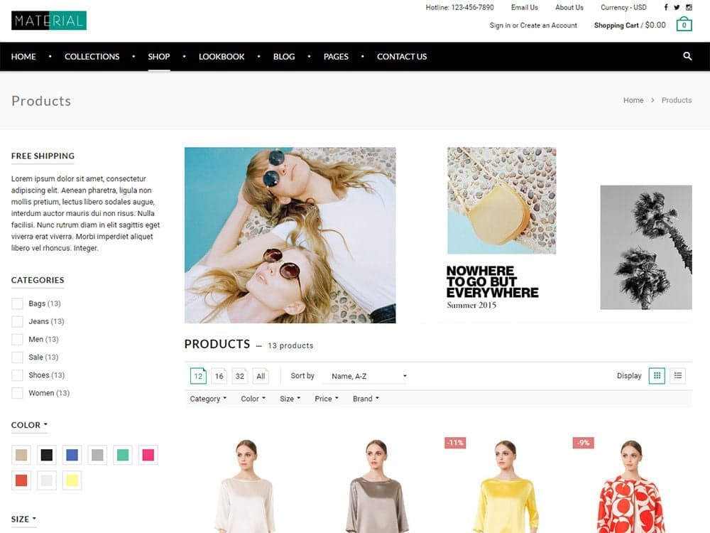
I like how the products feature uses icons instead of a dropdown. You can just click to update based on how many products you want to view per page.
Each link also uses a drop-down menu to hide the settings from view. Category, color, size, and other filters are all listed in the sidebar for easy access. But you can apply these same filters from dropdowns located in the product list too.
Redundancy can be a bad thing when used too much. In this case, I think it fits well and encourages users to filter their searches as required.
This technique works great if your product page has a sidebar. But what if it doesn’t?
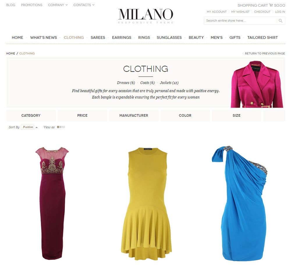
The Milano theme offers a solution with big grey blocks for the sorting options. You can filter by size, price, manufacturer, and a few other options.
Each block acts like a dropdown menu with custom JavaScript. Because the blocks are so large, they’re much better for mobile users who can only tap the options with their fingertips.
I don’t think this design would work well on all eCommerce sites. But I do think it’s an excellent example of custom product sorting.
You can also take a traditional interface element and give it a newer spin. Take for example the Journal theme which places most filtering options in the sidebar.
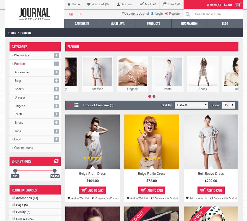
I’m not a huge fan of vertical interface lists, but they work well if the product grid still has enough space on the page. This example leaves plenty of space and gives the design a unique twist.
I’m talking specifically about the “shop by brand” section which uses logos instead of text. This can be problematic if visitors don’t recognize the logos. But I like this idea because it’s fresh, catches attention, and takes up much less space.
The same can be said of the “shop by price” slider which lets you slide to your required price range instead of using checkboxes for “cheaper than” filters.
Attractive Sorting Labels
Text labels clarify and direct users to their preferred sorting options. You could just place a bunch of dropdown menus in a row, but this would create a terrible user experience.
Sorting labels can have text, icons, or both. Most of the time they’ll just use text because it’s the simplest option.
I prefer minimalism when it comes to eCommerce sites because the focus should be on the products. Take for example the FutureLife homepage which includes text labels for sorting products on the fly.
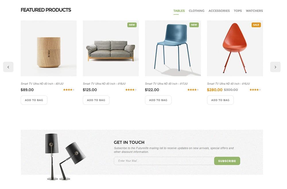
You can click any of the labels under “featured products” to sort through different product types like tables or clothing.
The product categories are scattered, but they’re also just demos for the theme, so the content doesn’t matter as much as the experience.
And while the homepage just uses text labels, the inner product page uses icons and text labels.
If you have enough space on the page and some design prowess to add icons, then I say go for it. Visuals are much easier to recognize than text labels, and most visitors can browse filters a lot quicker with visual aids.
However you don’t need to rely solely on the labels themselves. Take a look at this design which uses a dark grey banner behind the sorting features.
This really stands out against the plain white background. It’s a lot easier to browse through sorting features if you know where to look. Even on smaller screens this product sorting bar feature is very easy to use.
Clear attractive labels should be a goal for your sorting features.
The only way users can rely on them is if they can see them. Don’t make your labels jump off the page, but make sure they’re easy to recognize and that they appear in the same position on all product pages.
If you’re looking for FURTHER design ideas for your eCommerce site, in this article we discuss some of the lesser known ‘little details’ that go into building a successful shopping experience.
Dynamic Ajax Sorting
You may have noticed some of these examples sort products without a page refresh. This technique uses Ajax which has been around for over a decade but has been significantly refined in the past 4-5 years.
Modern Internet users hate waiting. A page load time of a few seconds is frustrating for most people.
Ajax results only pull the product data, so you’re not reloading a new page every time. Some sorting features do require a new page, like when you sort by a product category, but if possible, try to use Ajax for the simpler stuff.
In the Vanis Fashion layout you’ll notice a simple fading animation between sorting features. You can quickly change from a list to a grid and back without a full reload.
This is also true for changing the sorting option from alphabetical to anything else. Even most of the sidebar sorting features are dynamic.
If you click one of the price filters, then the product list updates and fades into view. Then you can un-check that same price filter to get all the results back again.
Users don’t want to wait around for individual pages to load if they don’t have to. Keep this in mind when building your eCommerce layout, but also remember that not everyone supports JavaScript either.
However don’t cut Ajax/dynamic loading just because a minority of Internet users block JavaScript. The future of the web is dynamic and from what I can tell there’s no slowing down.
One of the best Ajax-powered filters is the price range slider. Take a peek at the Handy theme to see what I mean.
You can slide the scrubber icons left and right to limit your price range. As you drag these icons you’ll notice certain items disappear from the products list.
It happens so fast that it can feel instantaneous. This is exactly what modern web users want to experience: a snappy interface that reacts quickly to user input.
As users update filters these new settings can be stored in the URL. With Ajax interfaces, the page won’t refresh, but the URL can be updated so if the user copies the address it’ll keep the filters intact.
You can see this live on the Wooden theme which auto-updates for a large portion of the filters. The color, price, size and “sort by” filters all update dynamically with Ajax.
But if you pay attention to your browser’s address bar while updating these filters, you’ll also notice the URL changes. This can be achieved without refreshing the page, and it helps to build a consistent user experience.
The URL update technique is one little quirk of using Ajax loading. It’s an easy feature to add and it’s incredibly helpful if any shoppers copy/paste the URL into an email, social media update, or bookmark it for later use.
I encourage Ajax behavior if you can get it working right. Just remember that not everyone can support JavaScript so always offer fallback options whenever possible.
Sort by Product Properties
The most popular sorting options are the ones that apply to every eCommerce site. These include the total number of items per page and the sorting filter (recent, popular, by price, etc).
But product properties help users find what they’re looking for by filtering products in each catalog list. These properties can include colors, size, weight, price range, manufacturer, or anything similar.
This can be tricky to implement because product properties change based on the type of products listed. But these property filters are incredibly helpful when designing an eCommerce site with hundreds or thousands of different products.
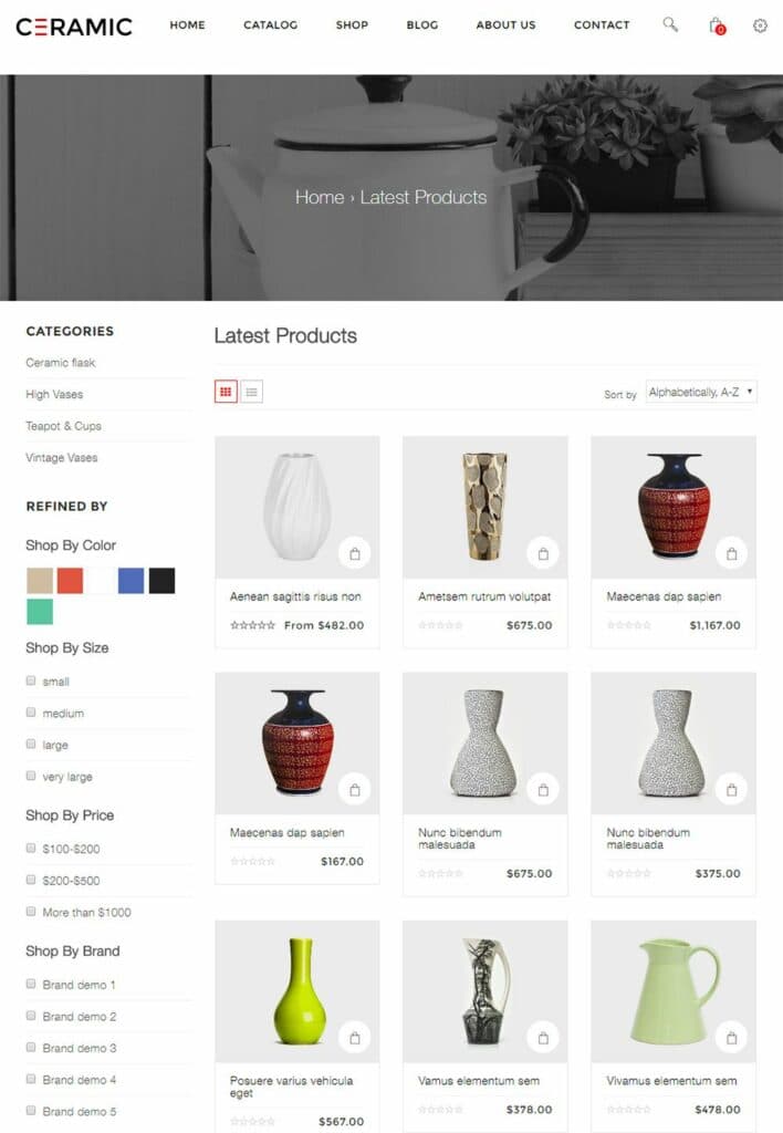
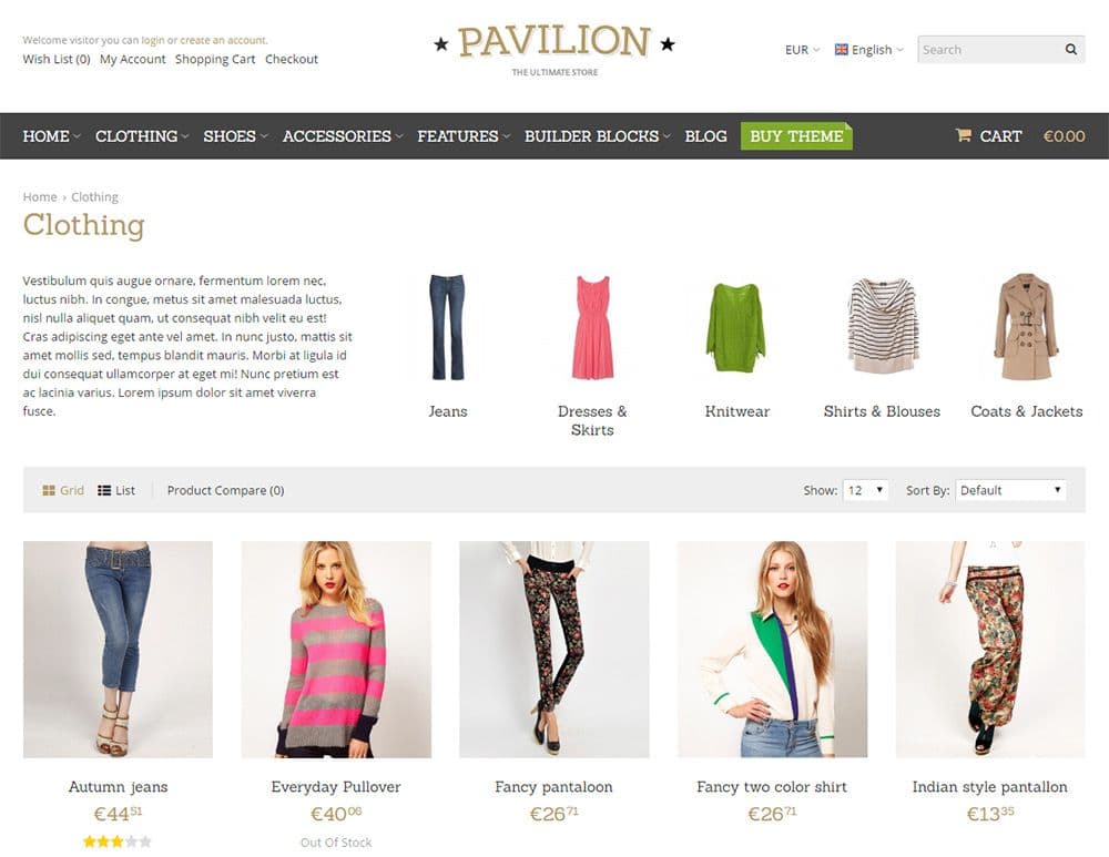
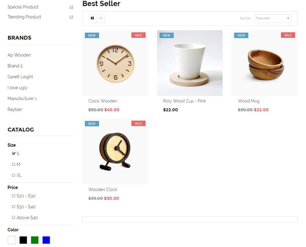
Take a peek at this theme to see a very basic example. The design is incredibly minimalist so you’ll find a basic white background with darker colors for the text & labels.
Each sidebar filter pertains to certain vases and ceramics. You can sort by color, size, and a list of brand names.
This might not make sense when you’re looking at a simple demo. But consider an online shopper who prefers certain brands of clothing, pens/pencils, cleaning supplies, etc.
If you can make a custom feature to sort through brands this makes online shopping a lot more convenient to the shopper.
And don’t always assume that you need a large sidebar for these product filters. The MiniStore theme is a fantastic example of how to add custom filters without the sidebar.
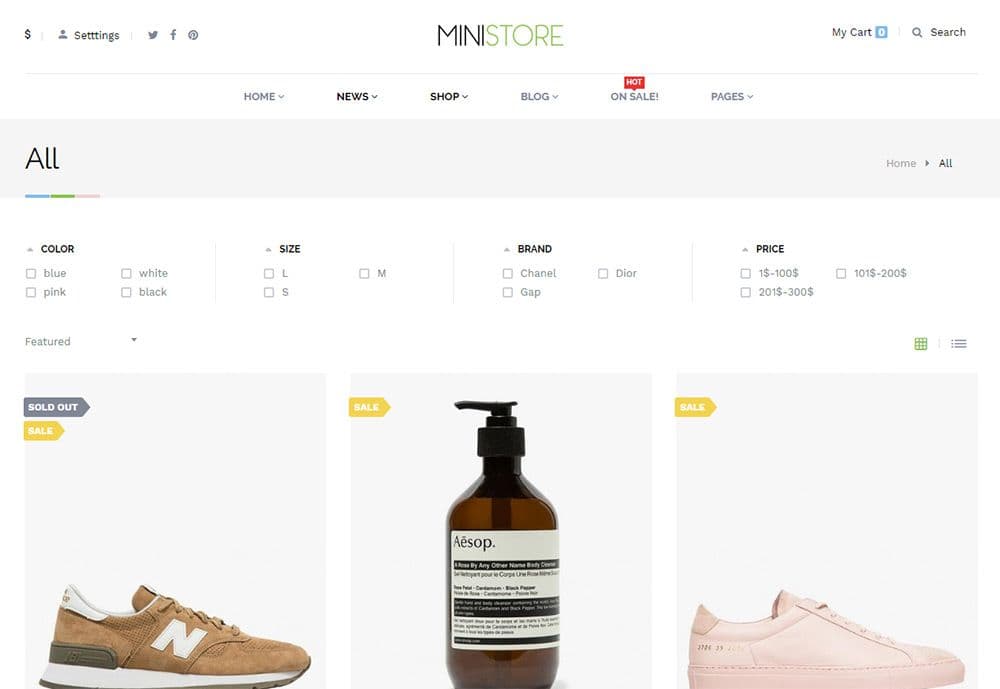
Personally I like the horizontal list. It’s much easier to read on wider screens, and it can always be adapted to fit better on smartphones. The beauty of responsive design is that you can work around any screen size.
As long as your layout works on all devices then there’s no right or wrong way to do this.
When you click to sort, you’ll notice the product page uses Ajax, and that the checkboxes even have their own custom styles. This example uses many different trends that I’ve mentioned in this post, so it’s a good demo to view first-hand how these ideas all come together.
One other feature I’d recommend is adding the total number of products next to each label. This way visitors can see how many products are listed under each filter without having to click to find out.
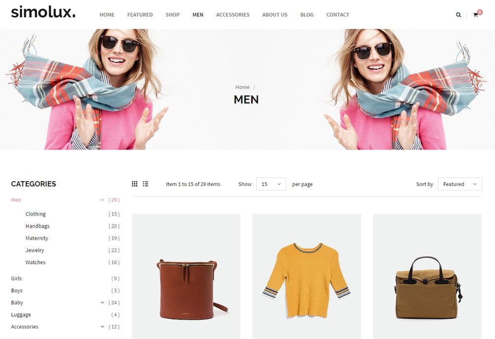
The Simolux theme uses very small labels with numbers in parentheses located along the sidebar filters. These numbers are easy to see and it’s fairly obvious what they mean.
If a user sees the number (0) beside one of the filters, they won’t even bother clicking. This feature saves time and makes the custom sorting links even more valuable.
Generally speaking there are two different types of sorting features. First, you can target the actual product layout list, and second, you can target which products are shown in the list.
I encourage you to add both filter types into your eCommerce layouts. The experience will be much cleaner, and the accessible product filters will likely encourage more sales.
Homepage Features
Most of this post focuses on the actual product catalog page. But many sites include product listings on the homepage too.
This gives visitors a chance to capture the most popular or recently added products to the shop without having to dig further into the website. But product sorting features need to be much simpler when they’re on the homepage.
Take for example the Electro theme with a homepage widget sporting products based on featured, trending, and best selling items.
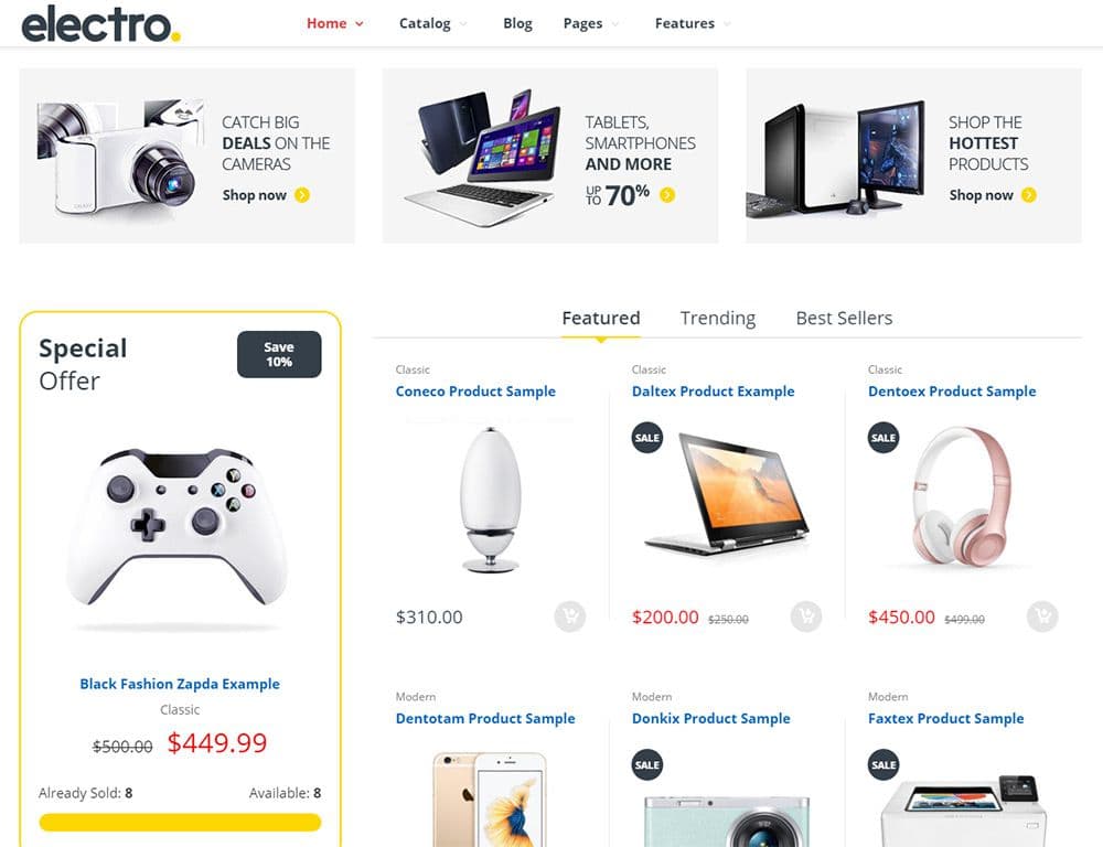
The user can select which filter they want to browse and can even click the products to get more info.
This homepage does include more traditional product widgets like a carousel slider and a “special offer” section. But the product sorting widget is also a very good idea because it gives visitors a chance to browse without having to click over to the catalog.
Try to avoid adding too many filter links onto the homepage. A cluttered homepage is usually an annoying one, so keep the filters simple but valuable.
The best products to list are the newest and most popular. You can also include top sellers or the highest rated products, or even have something like a “shopkeeper’s pick” where you select certain products to highlight.
As long as the product sorting links are simple they’re usually a very good idea. Create a widget that catches attention and helps users browse through products but doesn’t take up the entire homepage.
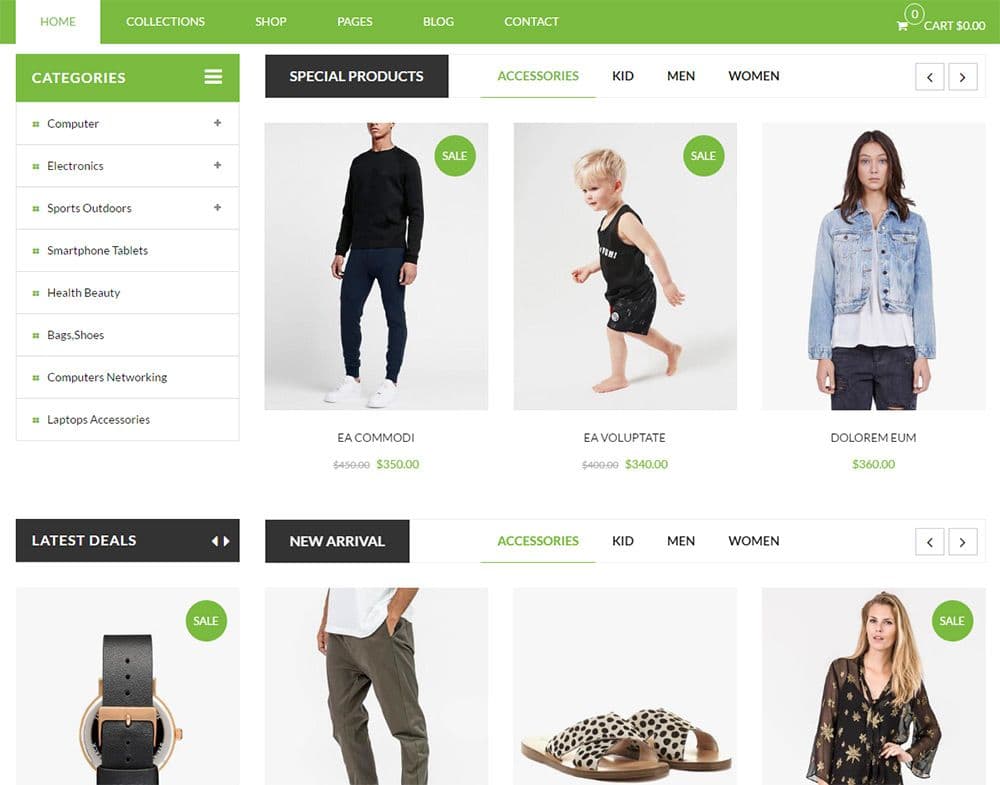
Here’s a cool example from the SP Janshop layout with widgets for special products and new arrivals. Each widget has its own set of filter links based on categories (kids, men, and women’s clothes).
Instead of a lengthy grid layout these widgets use carousel rotating features to save space. And the filter links load new products via Ajax so you can browse without reloading the page.
I wouldn’t recommend adding so many different widgets onto the homepage. Since this is a demo, it’s made to show off all the available features. But you can always style your homepage filters with a focus on one particular product or series of products.
You can also forego filters on the homepage and keep them on your product pages.
But try not to limit features based on your personal preferences. Instead think of how people typically browse eCommerce websites and where you can include product filters that add the most value.
I’d wager that most Internet users expect some product sorting features on every eCommerce website. They make browsing a lot easier and help users quickly discover products based on their preferences.
There are many ways to style, organize, and build these product sorting features. But the trends and best practices in this post should offer a solid foundation to gather ideas for any eCommerce web project.
You might also like to discover the latest trends for designing featured post sections or dynamic sidebar content.