The go-todesign language of Steve Jobs is back. Are you ready for the return of Skeuomorphism?
That’s right. You heard me. Skeuomorphism is back.
Steve Jobs’ go-to design language – the art of digital user interface design that mimics the characteristics of real-life objects – is making a return, after being banished from most of our screens since the introduction of iOS 7.
A design trend that began as a well intentioned way to make software less daunting, had a nearly two decade run as the style of choice amongst UI designers of all stripes. But, after escalating to an obnoxious level, exemplified below in a screenshot of the iBooks app on a 2012 iPad, designers far and wide called time of death on skeuomorphic design.
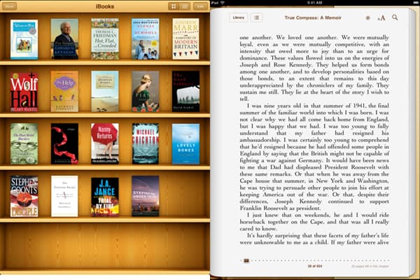
Now, more than five years later, with minimalism almost ubiquitous, it appears the controversial design style may be back, albeit a little toned down than where when we last saw it.
And why shouldn’t it return? Design is a cyclical beast. What’s in one day may be out the next, and then may be back in a couple of days later.
While it may have left a bad taste in our mouth, skeuomorphism as a concept isn’t necessarily as extreme as it was in its last iteration. And, while the concept is making a comeback, it’s probably safe to assume the leather stitching of Apple’s calendar app won’t be.
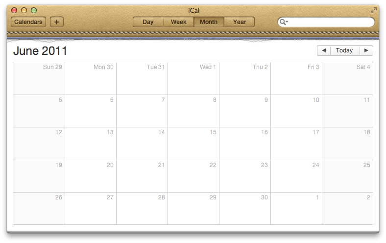
Aside from the literal references to real world object fatigue, what influenced the decision for most designers to stop utilizing the skeuomorphic style, all those years ago, was how challenging it was to scale to different sizes of screen.
At a time when smartphones were growing in size, and tablets were still relatively new to the market, adapting 3D bookshelves with wooden textures to fit an iPhone app, tablet, and web browser became too challenging.
Eventually, designers pivoted to flat UI principles. And, pretty quickly, Apple itself drew a line in the sand, throwing the baby out with the bathwater with the introduction of the drastically different iOS 7.
But, looking back, it was an overcorrection.
Sure, I don’t think many of us are truly missing the overly literal mimicking of bookshelves, calculators, cd players, and Mondaine clocks. But, the principles behind skeuomorphism are still very relevant, and have gotten lumped in with the texture choices that eventually made the trend feel overbearing.
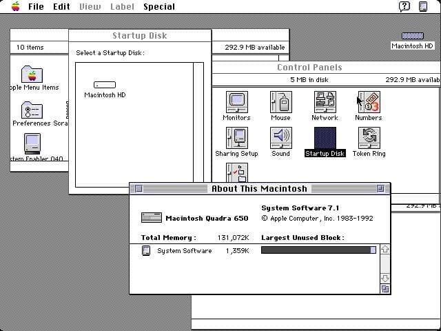
The simplest example of the principles of skeuomorphism being employed well is your computer’s desktop. Get it? Desk top? Your windows act as sheets of paper filling your desk that you move around, and layer as you like – that’s skeuomorphism.
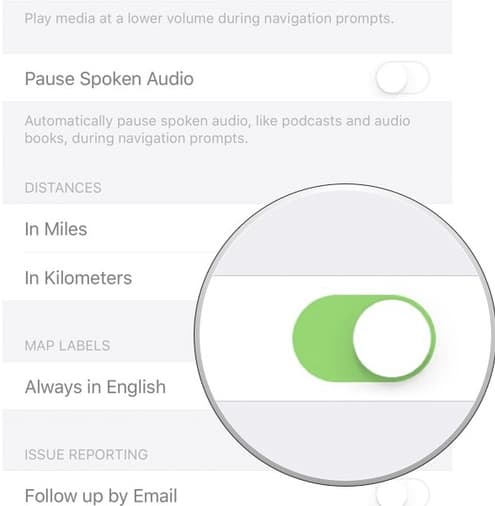
The switches in your settings app for you to turn functions on and off – that’s skeuomorphism.
The tabs on your web browser that you use to flick from page to page – that’s skeuomorphism.

Even the buttons that are an important element of Material Design are skeuomorphism.

The principles of skeuomorphism never really went away. But, now that technology has evolved, and in some ways settled enough for us to know more or less how many screen sizes we have to design for, how high the resolution needs to be, etc, we can afford to move another inch away from an overly minimalistic approach to design, into one that brings an element of playfulness back. But, more than that, intuitiveness.
We’re all very impressed with how stunning a stark white canvas with thin black icons, and light typography can look. But, now it’s time to remind users that they can actually interact with these elements again. And with a wave of VR, and AR experiences around the corner, the return of this once ubiquitous design trend can’t come at a better time.
Here are some examples of tasteful ways skeuomorphism is creeping back into design.

Discover the top UX/UI design trends of 2020.


