Want to learn how to evoke all the emotions of the rainbow using color? Here are the top color palettes for 2021 and the color psychology behind them...
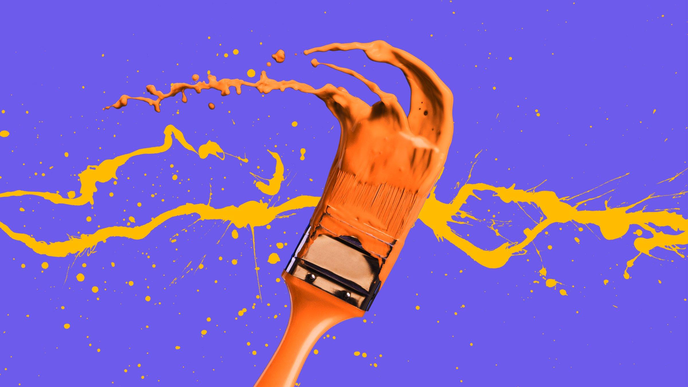


Have you ever wondered why certain color palettes are used in design projects more than others? Or why some colors are more frequently featured in advertising and marketing? Two words: color psychology.
While many of us have an inherent understanding of what particular colors ‘mean’ – such as the color blue being associated with calm and serenity, or the color red representing romance or danger – the question remains, why?
Color psychology is the art of manipulating the mind by using certain colors to evoke specific emotions, thoughts or feelings. Colors may affect each of us differently depending on our personal experiences or current moods, but color psychology can be a helpful guideline on how different colors can enable you to create visuals that connect with people in a specific way.
What Is Color Psychology?
Color psychology is the study of how color impacts the way we perceive the world around us. Colors can have a powerful effect on our emotions, as well as consumer behavior. Essentially, color psychology is a framework for understanding how we interact with different colors and why.
If you want to integrate color psychology into your designs, here are the top colors for 2021 and the psychological theory behind why and how they work.
1. Red
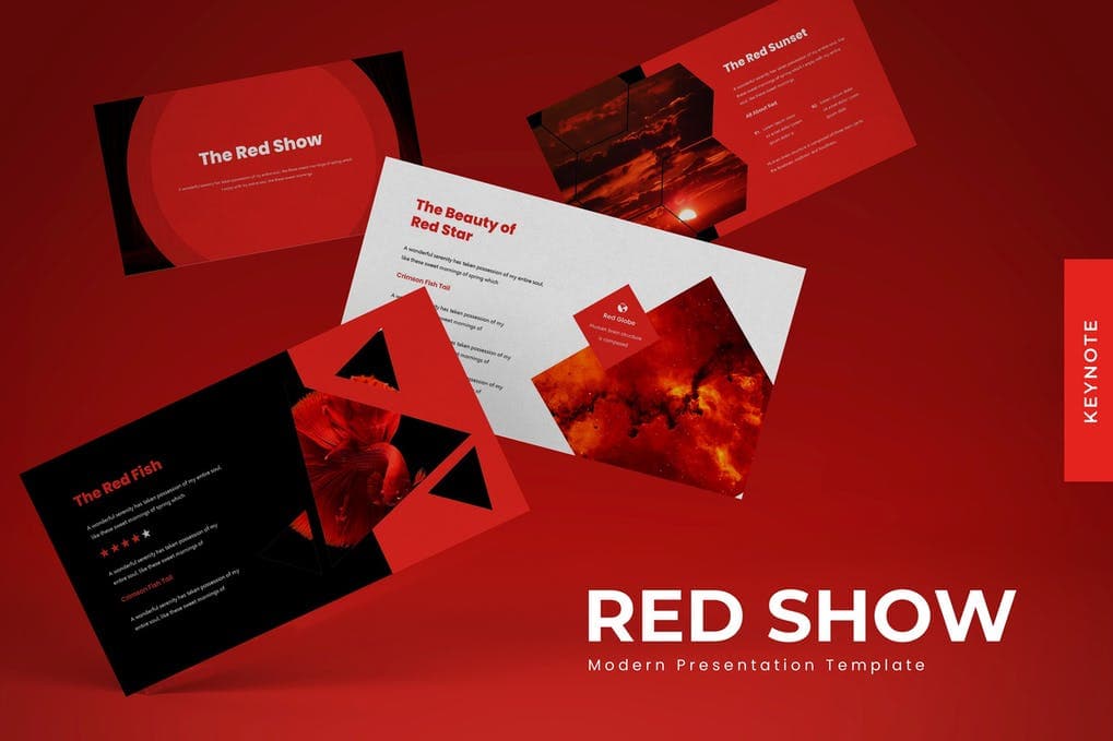
One of the most evocative colors of the rainbow, red is the color of emotional intensity. Red’s associations with passion, romance and danger, and its ability to catch the eye is the reason why it’s often used in signage, branding and even to warn people of impending risk or peril.
Red has been shown to reduce analytical thinking and speed up and intensify our reactions. In fact, athletes up against opponents wearing red are more likely to lose, and, if exposed to red just beforehand, students tend to perform worse on tests. But, it’s not all doom and gloom…
Red is also associated with excitement, passion, impulsiveness and spontaneity. This is why the color red is fantastic for sales, limited time offers or countdowns – it gets the blood pumping and inspires action.
The super stimulating color’s effect on the psyche is not subtle, so if you’re wanting to integrate it into your designs or branding, it’s important to be thoughtful and wary about how you use it. For example, it features just on the sole of Christian Louboutin pumps, and is contrasted with white in Coca Cola branding.
Positive associations:
- Power
- Passion
- Energy
- Fearlessness
- Strength
- Excitement
Negative associations:
- Anger
- Danger
- Warning
- Defiance
- Aggression
- Pain
To integrate red into your next project, check out our Ruby Red Collection on Envato Elements!


2. Blue
On the flipside, blue is the color of calm and serenity. According to color studies, blue is the most common favorite color among the world’s population. It’s the color of the sky, the ocean and is associated with clarity and communication. In fact, people have been found to be more productive, serene and focused when working in a blue room.
Encapsulating shades from bright Azure to Classic Blue to deep Navy, blue is considered non-threatening, conservative, and traditional. Many successful brands such as Facebook and American Express have chosen blue to be the cornerstone of their visual identity, as it’s seen as a sign of stability and reliability. While also linked to sadness and emotional coldness, overall, blue is a restful and relaxing color.
Positive associations:
- Trust
- Loyalty
- Dependability
- Logic
- Serenity
- Security
Negative associations:
- Coldness
- Aloofness
- Emotionless
- Unfriendliness
- Uncaring
- Unappetizing
To integrate calming and reliable blue into your creative work, check out the items in our Blue Illusion Collection on Envato Elements!


3. Yellow


One of Pantone’s Colors of the Year for 2021, yellow is a happy and hopeful hue. The color of sunflowers, citrus fruits and sunlight, it sparks hope, creativity and new ideas. Being the lightest color on the spectrum, yellow is uplifting and illuminating, and evokes feelings of exuberance and fun.
However, too much yellow can also trigger anger, frustration and anxiety. Due to the fact that it has one of the longest wavelengths on the spectrum, it’s one of the hardest colors to take in. In fact, some studies have proven that a little yellow is enough to make a baby cry. It’s also a color associated with cowardice, irrationality and weakness.
But, when utilized correctly, yellow is the perfect color for improving mood and lifting self-esteem. As the most visible color, it’s both stimulating and attention-grabbing – which is why traffic signs, advertisements, legal pads, and warning labels take advantage of its eye-catching nature, as well as fast food chains such as McDonald’s, Denny’s and Subway.
Positive associations:
- Optimism
- Warmth
- Happiness
- Creativity
- Intellect
- Extraversion
Negative associations:
- Irrationality
- Fear
- Caution
- Anxiety
- Frustration
- Cowardice
To embrace mellow yellow, check out our Sunshine Yellow Collection on Envato Elements!


4. Green


Sitting comfortably in the middle of the spectrum, green is the color of balance. Representing nature, health and freshness, like blue, green is considered to be calming and restful.
The color of trees and nature, green is naturally very reassuring and grounding. It is also the easiest color on our eyes because it requires no adjustment when it hits the retina. In fact, green can actually improve vision, and is used in night vision because our eyes can discern the most shades of it.
But, green also has a negative side. While simultaneously being a symbol of health and abundance, it is also associated with sickness, envy and jealousy.
Green is often used in branding for its calming and reassuring effect: think Whole Foods, Land Rover and and Starbucks. It’s also featured in decor, for example, performers wait in a “green room” to help them relax before a performance, and green product labels often suggest something natural, healthy or organic.
Positive associations:
- Health
- Hope
- Freshness
- Nature
- Growth
- Prosperity
Negative associations:
- Boredom
- Stagnation
- Envy
- Blandness
- Enervation
- Sickness
To integrate natural, balanced green into your work, try out some items from our Go Green Collection on Envato Elements.


5. Pink


A color associated with love and romance, pink typically represents traditionally feminine attributes such as softness, kindness, nurturance, and compassion. Encapsulating everything from magenta to Living Coral, pink is thought to have a strong emotional effect on the psyche.
As well as emotional depth and compassion, pink is associated with support. It’s a color of transformation and creativity, encouraging the birth of new thoughts and ideas.
While usually an inoffensive color, pink has also been associated with negative characteristics such as immaturity, shallowness, passiveness, flippancy and impulsiveness.
For branding, pink is particularly on trend right now. Millennial Pink – as it was first labeled in mid-2016 – has been used everywhere from Instagram posts and Tumblr pages to branding and catwalks, and Pastel Pink can give any design a young, fresh feel.
Positive associations:
- Imaginative
- Passion
- Feminine
- Creative
- Innovation
- Balance
- Trendy
Negative associations:
- Flippancy
- Childish
- Raw
- Impulsive
- Eccentric
- Ephemeral
To think pink, check out our Flamingo Pink Collection on Envato Elements!


6. White


In its most basic form, white is actually the reflection and absence of all color. For this reason, it has long been a symbol of purity and innocence. Associated with fresh starts, white is quite literally a clean slate on which to build any design.
Used incorrectly, white can bring to mind feelings of sterility, coldness, emptiness, and isolation. However, it has more recently been taken up within the minimalist movement to represent simplicity and sophistication. Leveraged by brands like Apple to evoke a chic, sleek style, white is the most modern and minimal of colors, and is great for creating space in design.
Positive associations:
- Cleanness
- Clarity
- Purity
- Simplicity
- Sophistication
- Freshness
Negative associations:
- Sterility
- Coldness
- Unfriendliness
- Elitism
- Isolation
- Emptiness
To go minimal and use white space in your next design, try out some items from our Ultra White Collection on Envato Elements!


7. Black
The exact opposite of white, black is the total absorption of all colors. It is the absence of light, which gives it ominous overtones and profound psychological implications. Black symbolizes power, darkness, seriousness and sophistication.
While black has been used by brands such as Chanel, Nike and the New York Times to imply classic style and sophistication, it’s also the color of death and mourning, and associated with oppression, suffering and evil.
When used in design, black is timeless, chic and effortlessly stylish. With the recent introduction of dark mode, black has become particularly popular in web and graphic design, replacing white as the main color for creating space.
Positive associations:
- Sophistication
- Security
- Power
- Elegance
- Authority
- Substance
Negative associations:
- Oppression
- Coldness
- Menace
- Heaviness
- Evil
- Mourning
To go back to black, check out our Raven Black Collection on Envato Elements.


8. Gray
Another of Pantone’s Colors of the Year for 2021, gray is modern and sophisticated. It’s a solid and dependable color, representing a firm foundation on which to build.
The color of mountains on the horizon, pebbles on the beach and natural elements that have stood the test of time, Ultimate Gray evokes feelings of composure, steadiness and resilience.
Skillful use of gray can be powerful and ultra modern; it’s a crisp slate on which bold concepts thrive. A hue that has worked well for technology and luxury brands (Apple, Swarovski, Mercedes-Benz), gray’s neutrality and subtlety can be both a strength and a weakness.
Used in the wrong context or in excess, gray can be an overwhelmingly boring shade and evoke feelings of depression, blandness and monotony. However, when harnessed right, gray can be an incredibly sleek, strong and powerful color for design.
Positive associations:
- Timelessness
- Neutrality
- Reliability
- Balance
- Intelligence
- Strength
Negative associations:
- Lack of confidence
- Dampness
- Depression
- Hibernation
- Lack of energy
- Blandness
To integrate reliable grey into your next project, check out our Graphite Gray Collection on Envato Elements!


9. Gold
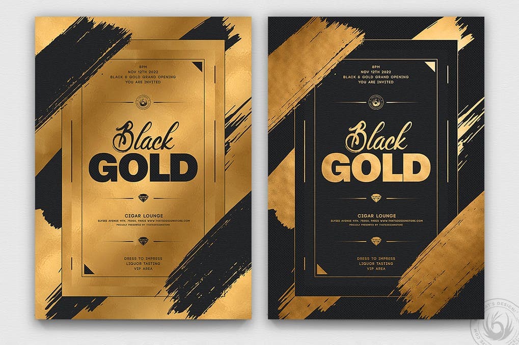
Gold is the color of success, achievement and triumph. Associated with abundance, luxury and sophistication, gold implies affluence, wealth and extravagance.
Optimistic and positive, the color gold illuminates everything around it. It’s generous and giving, compassionate and loving, and represents higher ideals, wisdom, understanding and enlightenment.
Associated with value and elegance, gold has been linked to masculine energy and the power of the sun – in contrast to silver which is associated with feminine energy and the sensitivity of the moon.
While gold can come across as showy and ostentatious, it’s become a fundamental color for many designers, as seen in branding like Versace, Lindt and MGM. The shimmering shade is so popular, it topped Envato’s color trends list for three years in a row, with a tremendous volume of searches for this color and related terms taking place on our platforms. These include gold textures, gold logos, gold background and gold text.
Positive associations:
- Success
- Abundance
- Wealth
- Wisdom
- Luxury
- Passion
- Charisma
Negative associations:
- Self-centred
- Demanding
- Ostentatious
- False
- Greedy
- Shallow
To go for gold, try out some items from our Glittering Gold Collection on Envato Elements!


And there you have it! We hope you learned something about color psychology and how to integrate color theory into your next project. Want more color inspiration? Check out our trend spotlight on Jewel Tones, our Design Trends Predictions for 2021 or our Color Trends for Designers in 2021!