Want to know which colors will dominate design in 2022? From pastel gradients to Y2K-inspired metallics, here are the top color trends to watch next year.
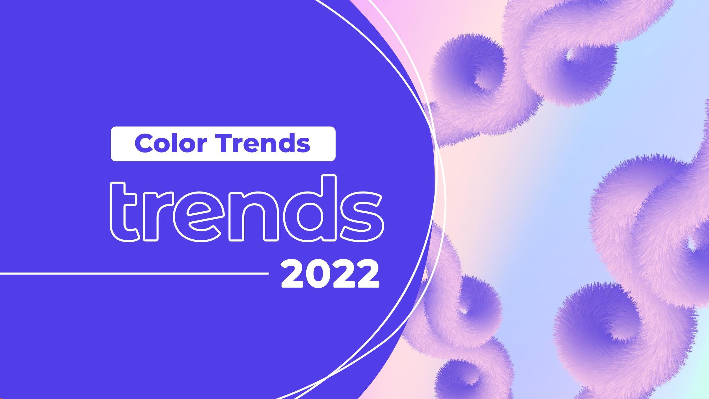


Color is an incredibly important design tool. It’s instrumental in evoking emotion, influencing behavior, conveying tone, defining style, and much more. However color trends come and go, and with a new year around the corner, designers are being presented with an exciting new selection of color trends to experiment with in 2022.
In contrast with the edgy, complex color trends of the past few years, we expect to take things back to basics over the coming year. The trends we’re seeing include everything from gentle, muted tones and simplistic color palettes to comforting retro hues and noughties nostalgia, providing innovative yet familiar palettes with a modern twist.
Ready to find out which colors will be splashed across the creative industries in 2022? From pastel gradients and earthy hues to Y2K-inspired metallics, here are some of the most inspiring color trends to watch over the next year.
1. Pastel Gradients
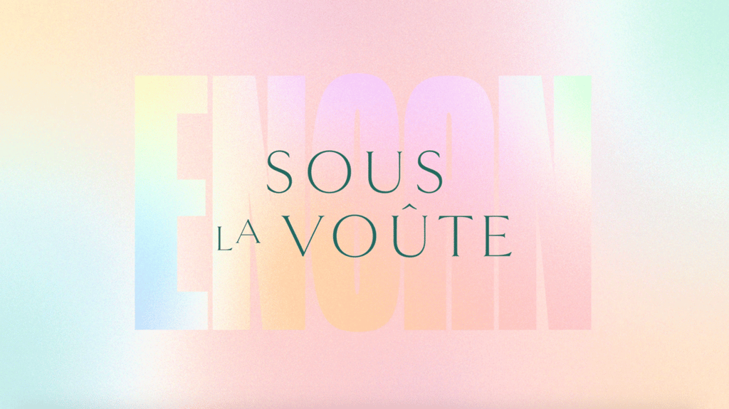
Colorful yet subtle, pastel gradients provide a calming, aesthetic foundation for any design. For example, this branding project by Quebec-based design team Agence Masse combines text overlays with pastel pinks, blues and purples to create a simple, soothing composition.
“Who said gradients were dead?” says Envato lead digital designer, Sophie Dunn. “We’re seeing lots of dreamy, flowy gradient shifts in the pastel spectrum, and it’s hard to look away! Use a radial or angular blur to blend colours into one another seamlessly, and try adding a subtle grain texture over the top to give it a bit more grit. The aim of the game is to make it stand the test of time.”


To integrate pastel gradients into your own work, check out Pastel Gradients by WildOnes from Envato Elements. Featuring 20 vector gradients ranging from smooth to textured, these pastel backgrounds will add a trendy touch to any branding or marketing project.


2. Natural Earthy Hues
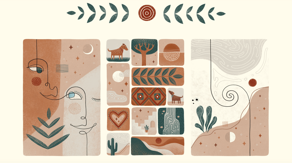
With the rise of DIY and organic design, natural earthy hues are making a comeback. Spanning rich browns, creamy beiges and terracotta reds to greens, ochres and greys, these neutral colors have become particularly popular for creating with social media templates or use in branding design, websites, and stationery.
The world’s increased interest in sustainability and environmentalism, as well as a desire to get back to basics, has further fuelled the use of natural colors in many areas of design.
“With designers finding inspiration in nature and minimal spaces, natural earthy colours set a calming tone,” explains Envato graphics specialist, Kate McInnes.
Inspired by the organic design movement, these freeform artworks by Jessica Covella feature natural earthy hues, wavy fine lines and botanical illustrations. In addition, hand-drawn and collage elements offer a nod to the DIY design aesthetic. From foliage to abstract faces, every image is grounded in a warm, down-to-earth energy.


Want to add some earthy hues to your next design project? Check out our curated Earth Tones Collection for a wide selection of graphics, social media templates and brochures.


3. Primary Colors
Dating back to Ancient Greece, primary colors – specifically red, blue and yellow – have been popular for centuries. Creating a mood of vibrancy, optimism and youthful creativity, primary colors are great for making a bright, bold visual statement while avoiding clutter. Straightforward but undeniably stand out, primary colors are expected to make a comeback in 2022 due to their simple yet impactful effect.
“Piet Mondrian knew he was onto something,” says Sophie. “You can’t beat the big three if you’re going for impact, but you don’t have to settle for primary school vibes. Play with the vibrancy dial to bring depth and range to your color palette for something classic, yet edgy.”


Just look at these bright business cards, which are saturated with color while still giving the text plenty of space to stand out. If you want to play with primary colors in your designs, an easy-to-use template is a great place to start. Featuring the three fundamental colors, these Instagram Story posts are ideal for promotions, competitions and announcements.


4. Muted Palettes
On the other end of the spectrum, muted color palettes are becoming the go-to for a modern, minimalist look. Calming and easy on the eyes, muted palettes encourage us to dial down the saturation, in favor of subtler, gentler hues. Including everything from pale pinks and purple pastels to mossy greens and burnt oranges, muted colors are elegant, understated and quite important when you consider the amount of content we expose ourselves to each and every day – whether digital or in print.
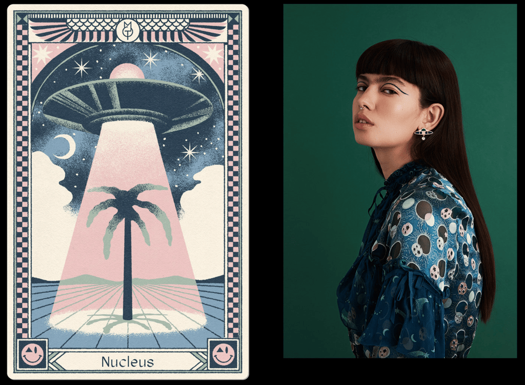
Used liberally across branding, social media, and web design, muted palettes are great for evoking a cool, calm and collected tone. For example, these bespoke tarot cards by graphic designer Max Löffler feature a muted palette of pinks, purples, greens and blues, resulting in some truly ethereal, aesthetic illustrations.


To embrace muted palettes in your own work, try out this understated social media kit featuring 10 editorial-style templates with customizable colors, text and images.


5. Bold Colors in Flat Design
Flat design has risen in popularity over the last few years. Focused on minimalism, functionality and usability, it often features clean edges, ample empty space and minimal detail. Its simplistic and ergonomic design makes it particularly well suited to posters, how-to guides, instructional web pages and apps. But, this design style is anything but boring, and we’re seeing more designers use bold colors to add an extra level of dimension to their flat designs.
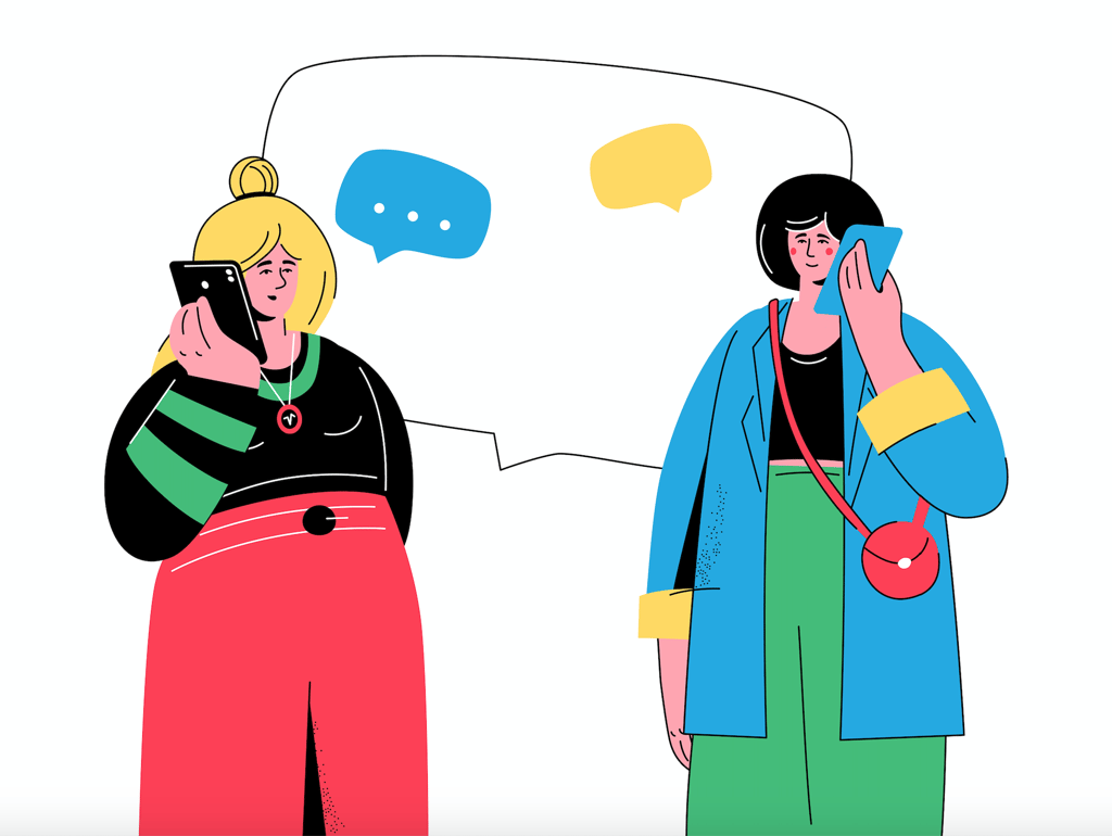
For example, the vibrant colors used in these static character illustrations create a dynamic, eye-catching visual effect. While the characters depicted conform to the flat design style, the bold hues and colorful details add plenty of visual interest.
To try out flat design with bold colors, check out this Phone Conversation – Flat Design Illustration by BoykoPictures, which pairs minimal detail with bright pops of color.


6. Y2K-Inspired Metallics
Drawing on 2000s pop culture, the Y2K aesthetic is officially back in vogue. Described as ‘futuristic with a retro edge’, this trend has begun infiltrating everything from fashion and social media to branding and graphic design.
Based heavily around cyberculture, the Y2K aesthetic is known for its shiny textures and holographic metallics, which are now becoming a big trend in their own right.
“This trend is very nostalgic,” Kate says. “Although, the holographic style has a lot more detail and definition than it used to.”
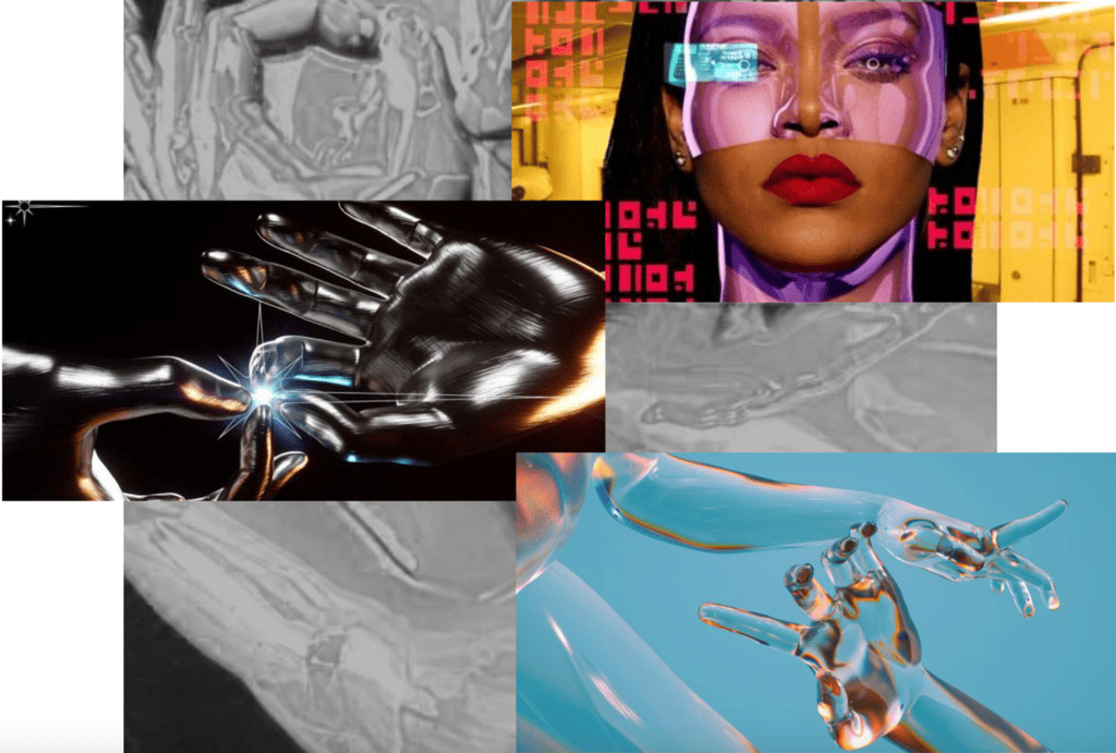
Featuring futuristic motifs and neon colors, these illustrations by China-based VIMLAB DESIGN use Y2K-inspired liquid metallics to add a swirling sense of movement.


Signalling a digital revolution for graphic design, there are plenty of ways to embrace the Y2K aesthetic. To add a dash of Y2K to your next design, try out these holographic and iridescent textures from Envato Elements. Or, incorporate a chrome effect into your text, collages and illustrations for a futuristic sci-fi feel. You can also check out our roundup of the top holographic design templates to create some mesmerizing, metallic masterpieces in no time.


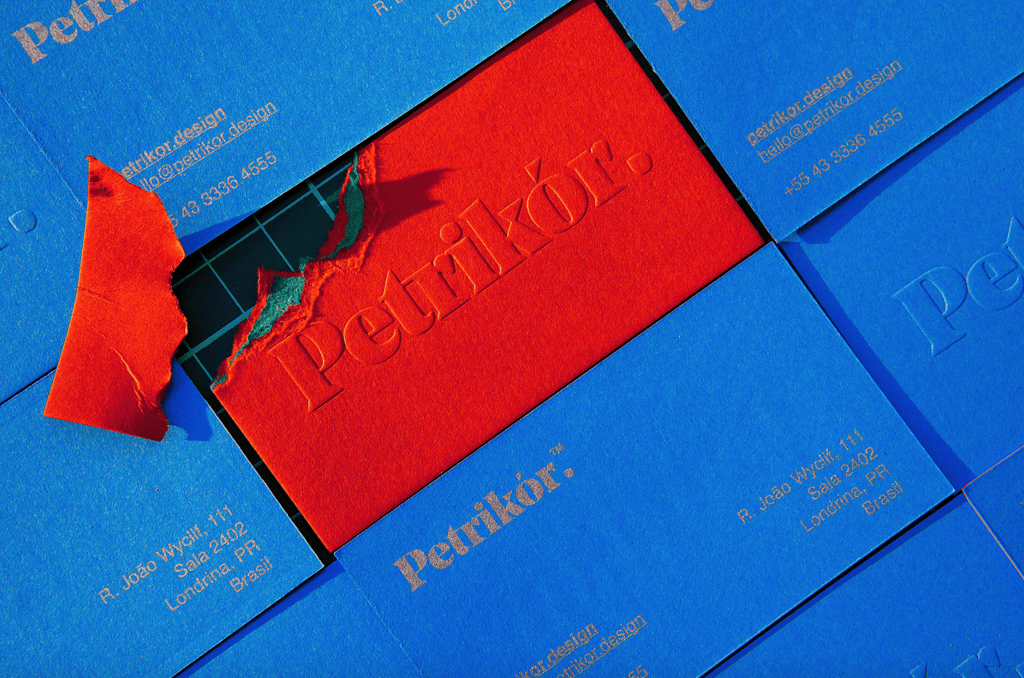
7. Color Blocking
The art of color blocking is simple yet incredibly effective. A style created by blocking out certain sections of a design or image with specific colors, this technique is great for drawing the eye to certain details or information, or even just creating a visually impactful image. Whether you choose to use complementary colors or punchier color pairings, color blocking is all about creating something eye-catching and bold.
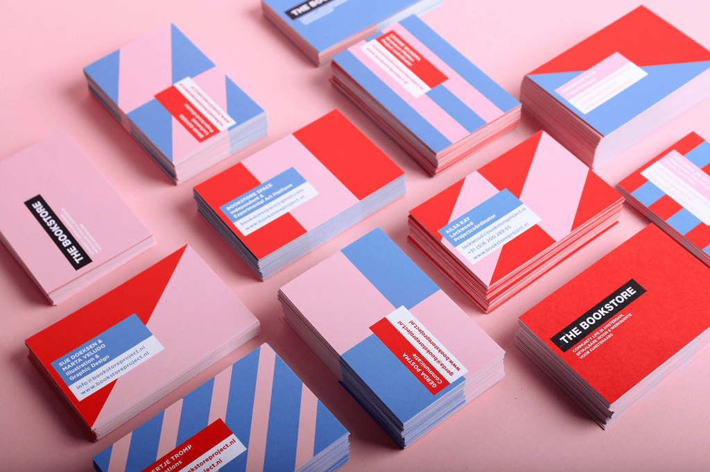
While incredibly versatile and suitable for all areas of design, this color trend is particularly popular for email design, pitch decks and branding. For example, Dutch designer Marta Veludo uses red and pink geometric shapes in her business cards, adding a splash of muted blue to add balance and space.


To use color blocking in your next slide deck or presentation, try out this Keynote template from Elements. Bursting with more than 50 full-color slides that are easy to customize, this template is perfect for pitches, showcasing statistics or even building a portfolio.


8. Faded Retro Color Palettes
Retro has been all the rage the last few years, and faded retro color palettes are the newest take on the nostalgia trend. Featuring sun-kissed tones and art deco-inspired palettes, faded retro colors are popping up everywhere from social media posts and branding to infographics and pitch decks.
Similar to the muted palette trend, retro color palettes are all about evoking a sense of comfort and familiarity.
“Often featuring bold-yet-muted color choices, retro color palettes evoke a nostalgic, relaxed and cheerful aesthetic,” Kate explains.


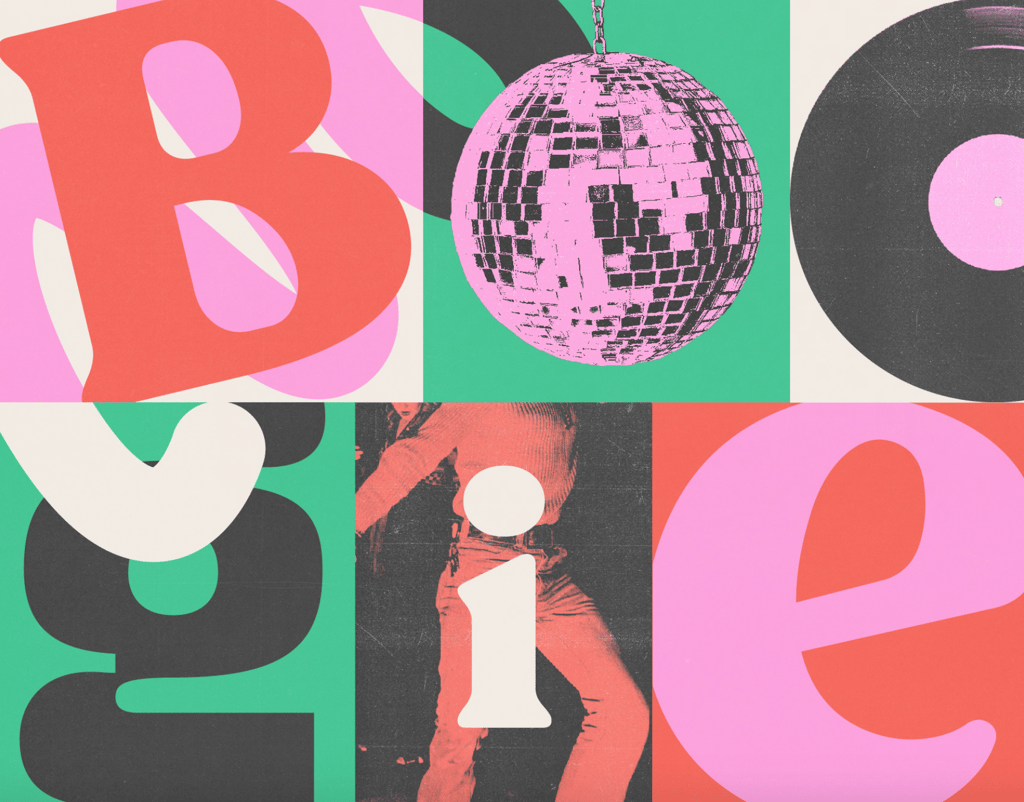
For example, this music festival poster takes us right back to the disco era with its faded pink glitter ball and grainy vinyl records. If you’re keen to add a retro feel to your next design, these warm and inviting podcast covers and Instagram Stories templates really embody the retro aesthetic. To continue your trip down memory lane, check out our retro design trends blog to delve into the design styles of the 60s, 70s and 80s on the modern visual world.


9. Pantone Color of the Year 2022: Very Peri
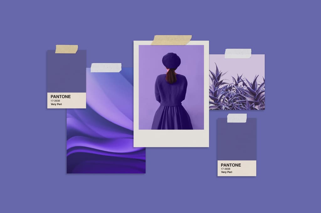
In contrast to the practical yet hopeful yellow-and-grey color story of 2021, the 2022 Pantone Color of the Year – PANTONE 17-3938 Very Peri – is all about fluidity, innovation and change. A dreamy periwinkle blue with vibrant violet-red undertones, Very Peri emanates a spritely, joyous attitude and dynamic presence to inspire imagination and creative expression.
As the world begins emerging from an intense period of uncertainty and adjusting to the new normal, PANTONE 17-3938 Very Peri is all about embracing the altered landscape, opening ourselves up to new possibilities, and redefining our futures.
Reframing the calming, reliable qualities that blue represents, and mixing in the passion, fire and creativity of red to fuel progress and change, Very Peri displays a carefree confidence, daring curiosity, and creative empowerment.
“The Pantone Color of the Year reflects what is taking place in our global culture, expressing what people are looking for that color can hope to answer,” explains Laurie Pressman, Vice President of the Pantone Color Institute. “As society continues to recognize color as a critical form of communication, and a way to express and affect ideas and emotions and engage and connect, the complexity of this new red violet infused blue hue highlights the expansive possibilities that lay before us.”


To incorporate this unique, empowering color story into your designs or creative projects, check out our Very Peri collection on Envato Elements for inspiration. Or learn how to create Pantone colors in your own designs.
That does it for the color trends you’ll be seeing this year. While you’re at it, check out our Procreate Trends and Graphic Design Trends for 2022. Or, head to Envato Elements to start creating today!