

Have you ever wondered what goes into the creation of a successful design piece? In this course, we'll talk about the principles of design and share some examples.
Watch the Full Principles of Design Course
Jump to these elements and principles of design:
What You'll Learn
- The principles of design definition
- The elements and principles of design
- The role each principle of design plays in a composition
About Your Instructor


Laura Keung
I'm a design writer, design mentor, and entrepreneur leading Laura Keung Studio, currently based in Munich, Germany. With 12 years of experience in the design industry, I lead my own design studio and collaborate with other creatives on branding and editorial design projects.
1. Introduction: What Are the Principles of Design?
While we’ve all seen our fair share of experimental pieces out there, it's important to know the significance of the fundamentals. Every design piece has a structure below the surface that holds up the design and makes it visually interesting and balanced. Once designers understand the usage of the principles, they’ll understand better how to break these rules.
In my previous article, The Basic Elements of Design, I talked about the elements that create everything we perceive. With a solid understanding of those elements, you’ll be able to learn more about the principles of design.


2. Principles of Design: Balance


For example, in a symmetrical design, the elements on the right side have the same visual weight as the elements on the left side. Symmetrical designs are easier to balance but can also come across as boring. Asymmetrical designs have different sides but equal visual weight. Being able to achieve balance in asymmetry can result in a visually interesting design that has movement.
Lack of balance would make your design feel heavy on one side and empty on the opposite. If you're wondering about principles of design balance examples, you’ll know your design lacks balance when it feels as if it’s falling off to one side.
3. Principles of Design: Unity


For instance, using similar colors that match and integrate elements organically makes it appear as if they belong together and are not just put on a page.
You can achieve unity by making clear relationships between visual elements. You can find unity wherever you find clear organization and order, and the elements of the page won’t be fighting for attention. Instead, they’ll work together to make the message stronger. Too much unity can result in a sterile design with a lack of personality. That’s when you can start incorporating other elements to add movement.
Lack of unity would make your design feel cluttered and confusing. Viewers will be attracted to the wrong element of the design and won't get a clear message. A good rule of thumb is to place an element in your design only if it enhances the message. Ask yourself what the element is adding to the composition.
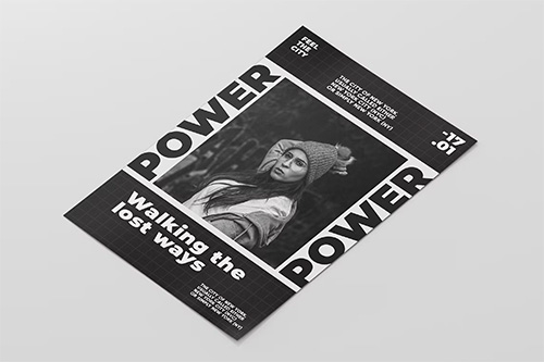
4. Principles of Design: Contrast


The variation makes certain elements stand out more than others. You can apply contrast by using colors, textures, sizes, and shapes.
In a layout, contrast is applied to create hierarchy between the font sizes. Larger text tends to be read before any smaller text. Contrast is important when it comes to pairing fonts. For instance, in the example below, we have a font duo that includes a script font and a sans serif font. The script font adds movement to the static sans serif.
Contrast in art is about creating a focal point to certain elements that can draw the viewer’s eyes. Contrast can also be used to create balance and harmony by making sure items are distributed nicely on a page. Lack of contrast can make a design look dull, and viewers can overlook the important message. Contrast is important especially when designing accessible documents. For instance, black type on a white background will be easier to read than black on a brown background.
Here are some principles of design examples:


5. Principles of Design: Emphasis


The purpose is to create something that will stand out from the rest of the page. You can use different elements to highlight a specific part of your design, like lines, color, positive/negative relationships, and many more. As long as you can create contrast, either with elements or color, you’ll be creating emphasis.
- Lines create direction on a page by pointing to specific elements that help the viewer’s eyes know where to go.
- Shapes can also draw attention. Using a group of similar shapes and breaking the group with a different shape will create tension and draw the eyes.
- Color can create an emphasis in any design. Buttons on a website tend to contrast with the background to create a sense of urgency and attention.
- Texture can be seen in materials to enhance tactile features. For instance, a business card can have an emboss or relief on a logo to emphasize it. Digitally, texture can be applied as a drop shadow on a button to appear three-dimensional.
- Space is also an option to emphasize certain elements in your design. Enough white space around an object can prioritize the focus on a single element. For instance, Apple has a clean and direct idea of emphasizing products.
6. Principles of Design: Repetition


We can call a grid a repetition of lines because it creates a certain consistency. In layout design, repetition is shown through the folio placement to help viewers find their way in a book or magazine. The same folio placement creates continuity in the repetition.
On a website, repetition is seen in the menu placement, which gives the viewers a constant placement that can make them feel comfortable and familiar. Repetition can also be achieved by repeating elements in a design like a logo or a tagline in a brand development project.
Here are some principles of design examples: Below, the repetition of waves gives a feeling that the page is endless. That's why in the principles of design, repetition is relevant.


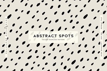

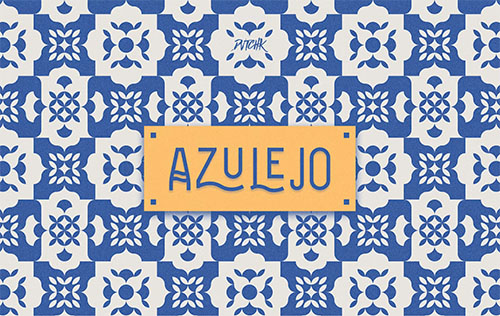
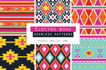
7. Principles of Design: Pattern


A seamless pattern is a repeated set of elements that flows without a flaw to create a unit. You can see seamless patterns predominantly in interior design when using tiles. The use of patterns can enhance the viewer's experience and the look of a final design.
In the example below, the pattern repeats itself from edge to edge without any disruptions. The pattern is composed of multiple elements with varying sizes and depths.
Here are some principles of design examples:


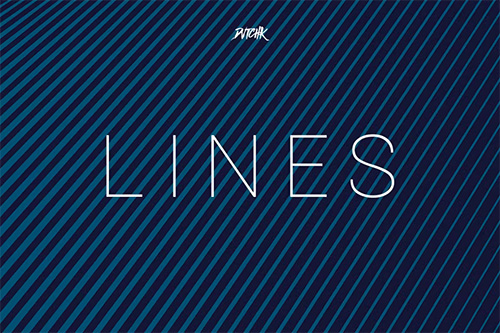
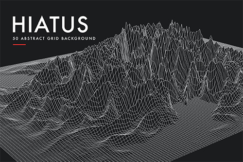
8. Principles of Design: Rhythm


Rhythm, a principle of design, has more complexity than the previous principles of repetition and pattern. Repetition and pattern are applied to the same element throughout a design.
Rhythm in art is usually not as obvious as the design principles of repetition and pattern. In the example below, the diagonal lines aren't arranged in a specific pattern. Instead, there's a repetition of the elements with variations.


9. Principles of Design: Movement


In an image, every element can affect how the eyes move. Important elements will lead to secondary elements and so on. Movement in a composition creates interest and dynamism that keeps the viewer engaged.
Movement can be created with rhythm when using a variation of an element repeatedly. Using curved lines and diagonal lines creates more movement compared to straight lines. Use lines to trace the path to the focal point. Color can help enhance the feeling of movement, juxtaposing high and low key colors to create energy. A literal way of showing movement is by using an image that includes motion, like a dancer or hair in the wind. Some artists use illusions like optical art, in which the repetition and contrast make our brains want to organize the information.
In the example below, movement is created by the slightly curved lines and the overlapping colors. Both effects enhance the movement because the lines are unstable and the gradient blurs the lines instead of being static.


10. Principles of Design: Proportion


Proportion is mostly about scale and size when two elements are compared. For instance, in art and drawing, proportion is important for the elements to look realistic. Proportion as a principle of design doesn’t necessarily refer to the size of one element but to the relationship of two or more elements.
In layout hierarchy, the proportion of the headline compared to the photo caption needs to be larger as the headline is the most important element. Smaller elements have less importance. When you achieve a good sense of proportion in a composition, it can add harmony and balance.
11. Principles of Design: Harmony


The elements shouldn’t be exactly the same or completely different but related in some way. Color palettes or similar textures can create a sense of unity between different components. Using similarly shaped items will create harmony because they will seem related.
Not enough or too much harmony can make a design dull; there needs to be some kind of variety for it to be visually interesting.
12. Principles of Design: Variety


Variety in design adds something interesting to the composition to create contrast and tension. For instance, mixing organic shapes with geometric shapes adds variety. This concept should reinforce the message you are trying to communicate in your design—otherwise, it can look pointless.
13. Let's Wrap It Up!
The elements and principles of art and design are the foundation for creating a composition. The use of these principles can give structure and help you understand how other design pieces and artworks are built. It can help you determine whether a composition will be successful or determine the missing piece of the puzzle.
The use of these principles will help you design with purpose by giving function to every single element in a composition. Communicating a clear message isn't only about the message but also about how we use design to deliver it cleanly and clearly.
When you look at a design composition from now on, think of these principles and how they are being applied. You'll be able to decode the most intricate designs and understand what's working and what's not.
Learn More About Design Theory
Did you enjoy this course? Then you might want to explore more awesome videos from the Envato Tuts+ YouTube channel:


If you liked this course about the principles of design definitions, you might like:

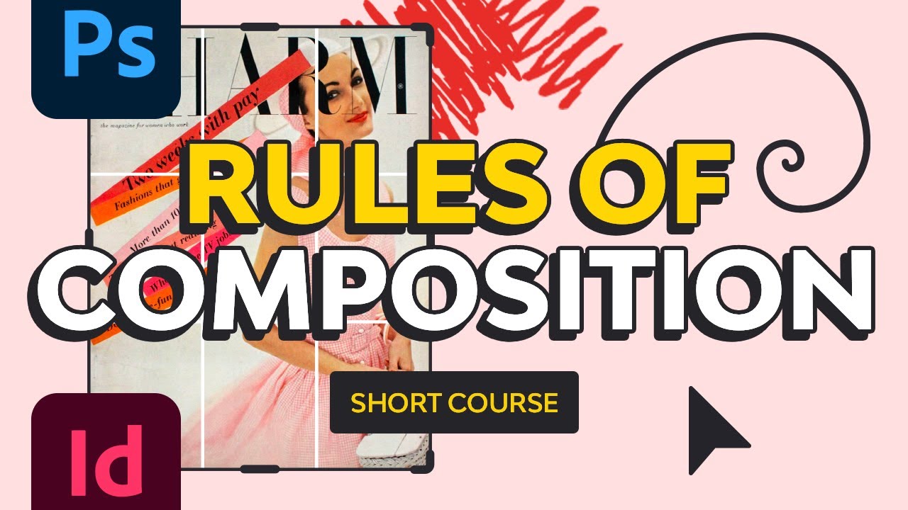
 Rules of Composition


 The Different Types of Logo (With Design Ideas)


 The Different Types of Fonts: When to Use Each Font Type and When Not

 Teach Yourself Graphic Design: A Self-Study Course Outline

- The 9 Different Types of Graphic Design

 These Movie Posters Are the Best, and Here’s Why


 65 Design Terms You Should Know

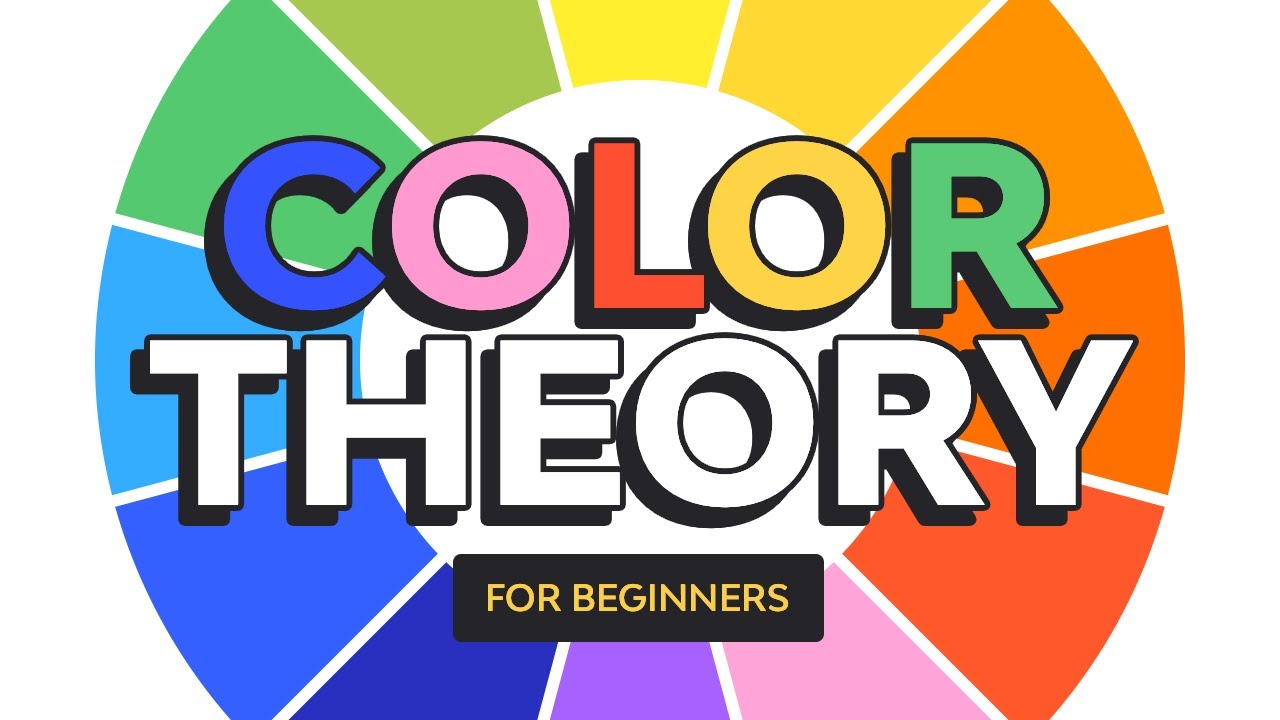
 The 5 Problems With Fundamental Color Theory


 Trending: How to Color Block in Graphic Design

 Smart vs. Stylish: How to Balance Design Principles With Design Trends


