

Font types, font design, and typography can have a huge impact on the legibility and visibility of designs for visually impaired viewers, a consideration that print and web designers often overlook.
Choosing the right type of font style to use on your print layout or website to improve design accessibility doesn’t need to be difficult or to compromise the overall aesthetic of your design. Here, you can find out more about how different types of fonts and font design can affect visually impaired viewers, and how you can make instant design accessibility improvements.


Jump to content in this section:
How Do Font Choice and Typography Affect Visually Impaired Individuals?
According to the World Health Organization (WHO), at least 2.2 billion people have a vision impairment or blindness, which means that an astonishingly high percentage of 28.5% of the world’s population have some form of vision impairment.

 How You Can Use Adobe Software to Improve Accessibility on Your Designs


 Building an Inclusive Web: Why Accessibility Matters

Visual impairment falls broadly into three categories, which have different or overlapping effects for how those affected interact with type-based designs:
Color blindness means that while the shape of text is not distorted, the color of text can be difficult to perceive, and the distinguishment between colors can be more difficult. Color-blind individuals can also be sensitive to color brightness.


Low vision (or low visual acuity) means that an individual can have partial sight in one or both eyes, blurry vision, tunnel vision, central field loss, and/or clouded vision. Designs with small-scale text or click targets can be difficult for affected users to read or see. While some individuals use specialist built-in browser zoom, many non-technical users are not aware of or don’t know how to use these extensions.


Blindness is the substantial loss of vision in both of the eyes. For printed and physical text, blind individuals have relied on Braille text, while blind internet users often turn to screen reader technology, which turns on-screen content into speech or shows it on a Braille display. The most popular screen reader software for Windows devices is JAWS (Job Access With Speech), while Apple users commonly use VoiceOver.


Other specific symptoms of visual impairment which can affect how individuals interact with text include:
- Visual snow, glare, ghosting, and cataracts—symptoms which can affect the clarity, position, and number of occurrences (double vision) of text.
- Nystagmus, which is characterized by rapid, involuntary, oscillatory movement of the eyes, can give the impression that text is jumping around or disappearing.
- An obstructed visual field, which includes floaters, an obstruction to one side (retinal detachment or hemianopia), obstructed central vision (glaucoma), spotty vision (diabetic retinopathy), or obstructed peripheral vision (retinitis pigmentosa or macular degeneration), can limit the individual’s field of view, meaning that some parts of the text in a design might not be visible.
An Example of Accessibility and Inaccessibility in Graphic Design in Practice
Let’s look at an example of how the choice of fonts and formatting of typography could affect the accessibility of a site for visually impaired individuals.
The New Yorker has been praised by type aficionados for its elegant use of typography. On the magazine’s website, the quirky and custom-designed serif font, NY Irvin, is balanced with geometric sans serif Neutraface and traditional serif Times New Roman.
As a publication with an intelligent reputation, The New Yorker has a text-heavy website, featuring a masthead and central headline teaser, alongside a number of other article titles around the periphery.


As stylish and aesthetically balanced as it might be, the typography presents a number of issues which commonly limit the accessibility of such sites to visually impaired users.
The New Yorker website performs poorly on three occasions, when faced with users with symptoms of low acuity (blur), ghosting, and a blocked visual field. You can use a vision simulator online that allows web designers to assess the accessibility of sites.
An individual with low acuity would struggle to read the text set at a smaller scale, such as the article teasers in the left and right columns, as well as body text in the headline area.


If an individual experiences ghosting (also known as double vision or diplopia), the website text becomes nearly completely illegible, meaning the accessibility in design isn't great. The ornate style of the serif font is no doubt an exacerbating factor in this, as the shape of individual letters is not instantly perceptible when overlapping. Again, not one of the best fonts for the visually impaired.


In the case of a partially blocked visual field, the fact that the layout is text-heavy and scattered around a wide area adds to the inaccessibility of the site. In the case of peripheral vision (commonly a symptom of either glaucoma or retinitis pigmentosa), the outlying articles become more and more difficult to see.


The website performs much better, however, on three other counts. If an individual has color deficiency (such as protanopia, red-green color blindness), only the images are generally affected, with the black text set against a white background proving to be a clear and legible color choice.


In the case of contrast loss, the high-contrast monochrome palette also counteracts the effect of visual ‘graying’. Users with cataracts, who commonly experience a clouded field of vision as a result, will also benefit from the high-contrast color of the text.


Based on all of these observations, the type designers behind The New Yorker are doing some things well for visually impaired users, but there are significant issues that could be changed to improve the accessibility of fonts and design.
While the black-and-white contrast of the text improves readability, the choice of a stylized serif font, small sizing of text and the quantity and scattering of text around the layout equate to a design that’s high on style but low on accessibility.
6 Steps You Can Take to Improve the Accessibility of Typography in Your Designs
Improving the accessibility of typography in your print or digital designs isn’t difficult. Below are six steps you can take to improve the legibility, visibility, and overall accessibility of typography and fonts.
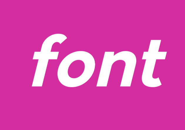
Use Common Sans Serif Fonts
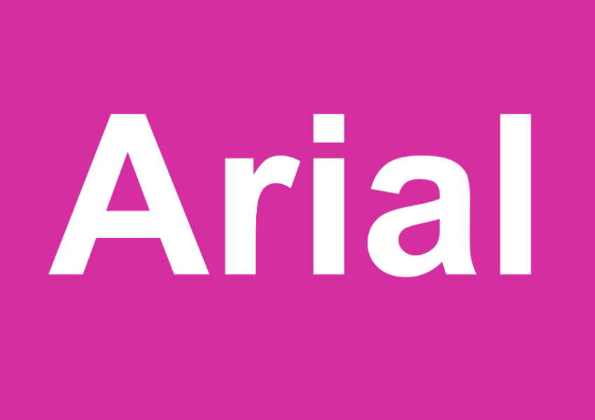
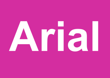
Currently, Section 508 of the Rehabilitation Act of 1973 does not pin down the requirements for choosing the best fonts for the visually impaired. However, the US Department of Health and Human Services has recommended the following accessible fonts for PDF documents: Times New Roman, Verdana, Arial, Tahoma, Helvetica, and Calibri.
These fonts tick two accessibility boxes. First, they are sans serifs. Lacking the extra flourishes featured on serif fonts that can impair readability, sans serifs are generally much easier to read and as such, more accessible fonts.
Secondly, these are common fonts, which as a result are less likely to be replaced on websites and are also processed more frequently by readers, making the style of the font more invisible and the text more readable.

Stick to One or Two Fonts in a Design
Multiple fonts can distract from the task of reading, which adds extra strain for a visually impaired viewer, so limit the number of fonts on a print or web layout to a maximum of two or ideally just one accessible font.


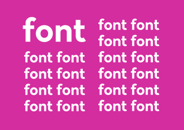
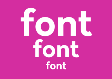
Increase the Size of Type
Use a minimum font size of 12 pt for web and print designs, but aim for even larger to improve visibility. The British government website, for example, uses a minimum font size of 19 pt.
Ensure key titles, calls to action, and important items of information are set in a large font size.


Maximize Color Contrast
Make sure the contrast between text and the background is as high as possible. Setting black text against white, and vice versa, is the obvious choice, but using colors from opposite ends of the spectrum will also help to maximize contrast in the case of color blindness.
Tip: Use a contrast checking tool to ensure that the color choices you’ve opted for are as contrasting as possible.


Avoid Animations
Text that flashes, moves, or disappears is not only potentially irritating for the majority of website users, but it can exasperate visual impairment issues, especially in the case of nystagmus (flutter). Avoid them to ensure a more accessible graphic design.


Avoid Using Italic and UPPERCASE Styles
Skewing and compressing text, as is the case with italicized type, reduces legibility, as does setting text in all caps. If you want to distinguish certain parts of your text, opt instead for a bold weight or increased font size for improved accessibility in design.


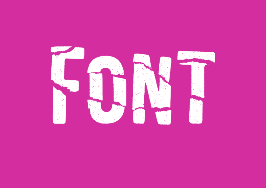
Avoid Using Novelty or Display Fonts
Novelty font styles tend to be more stylized than sans serifs and serifs, meaning that there is an extra layer of visual information to process. Extra texture, decoration, or flourishes increase the complexity of the font and reduce legibility. For a visually impaired viewer, this adds another task on top of the strain of trying to read the text.


When Designing Accessible Fonts, Aim for Clarity and Distinction
Font designers love to experiment with new type styles, shapes, textures, and colors in their designs. While this can result in a unique and eye-catching font, it doesn't necessarily mean the font is optimized for the visually impaired.
When designing your own fonts, aim to make the letters both clear and distinct from one another.
Improve the clarity of your letters by sticking to a clean, fuss-free sans serif style. Some lowercase letters like 'd' and 'b' can be easily confused, so make sure to create a distinction between letters that could be mixed up to ensure accessibility in design.


Conclusion: Improving the Accessibility of Fonts in Your Designs
By keeping design accessibility requirements at the forefront of your mind while you design or use fonts on print media or websites, you’ll ensure that you're producing accessible graphic design for visually impaired users.
While legislation regarding accessible font use on websites isn’t set in stone yet, pressure is growing on businesses to accommodate users with a visual impairment or other disability. Design is an area that can have a significant impact on the accessibility of media, so it’s increasingly important for designers to be aware of the needs of visually impaired individuals and to act on them in the work they produce.
To find out more about how to improve accessibility in your designs, check out these handy articles:


