Looking to learn how to design a mobile app? Get started with this 12-step guide to mobile app design.


With mobile apps expected to generate a mammoth $935 billion in revenue by 2023, many companies are considering launching their own apps. However, with 3.48 million apps available for download on Google Store alone right now, it’s a pretty competitive landscape.
With so many options to choose from, users are increasingly looking for apps that not only meet their expectations but exceed them. So how do you make your app stand out from the rest? It all starts with understanding the user, simplifying the experience, and delivering content in the right format. Want to know how to design a mobile app? Read on for our 12-step guide for designing a mobile app.
1. Conduct User Research
Your team may want to design an app with all the bells and whistles, but your users may prefer simple products with limited features and functionality. At the end of the day, it’s your target audience that’s going to use the app – so understanding their needs and expectations is crucial.
Here are some ways to get started with user research:
- Determine your target audience. Who’s going to use your app and why?
- Create an online survey or conduct user interviews to understand their challenges and needs.
- Go to the app store and search for competitor mobile apps. Go through the reviews for each one to understand what your users feel is lacking in the app, or what they love about it. This will help you understand the design standards your app must have to succeed, and the potential gaps to be addressed.
Comprehensive research is essential to know more about user behavior. Creating an app for amateurs in your sector differs from creating one for experienced users, where too many notifications could be detrimental. Consider an investment app for beginners as an example, where warnings and messages could be helpful for users who are new to the industry. The same wouldn’t apply to someone with much experience, though.
2. Make Load Times Bearable
According to Google, as page load time increases from one second to three seconds, the probability of a user bouncing increases by 32%. This means that if your app is slow to load, users are likely to find an alternative. Even when you prioritize speed in your app design and development, there will still be operations that will take some time to process.
Here’s how you can make the wait bearable for your user:
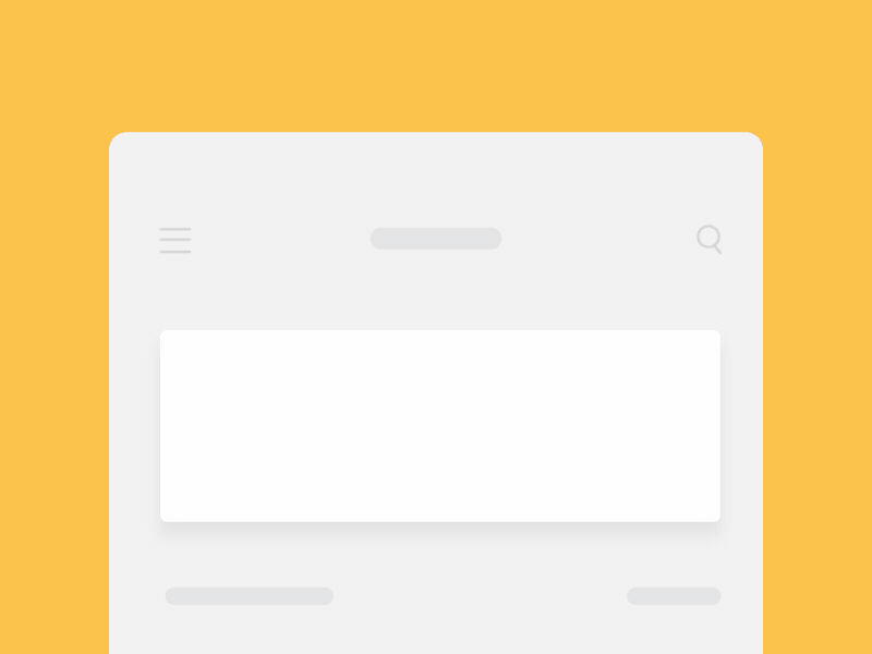
- Load the content first in the visible area of the screen while the rest of the content loads in the background.
- Instead of showing a blank screen when your app is loading show a skeleton screen. A skeleton screen shows information gradually loading onto the page – like this example from Medium.
- Give users something interesting to look at while the screen is loading – such as this animation by Queble, a reading app.
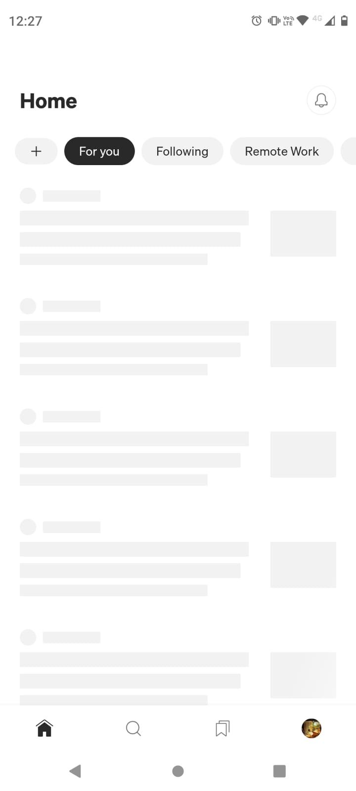
3. Simplify Your Navigation
A great mobile design helps users navigate the app seamlessly, inspiring them to explore its content. There are some basic navigation rules you should follow in mobile app design:
- Make use of standard navigation patterns so that users know how to explore your app. These can be navigation drawers for Android or a tab bar for iOS.
- Minimize user effort by curtailing the number of swipes, taps, or screens for frequent user actions such as placing an order.
- One of the recurring problems people face while using apps is not knowing how to navigate them. This can happen if an app has too many features or pages. To avoid its users getting lost, Medium indicates where a user is in the app at the top of the screen so they know where they are at all times, as well as how to navigate around.
- Don’t alternate between different navigation patterns. For example, if you’re following sidebar navigation, stick to it.
4. Avoid Clutter
Every icon, image, or button you add to your app can make it more complicated. Try to avoid clutter in your design process, and be mindful of what you add to the screen.
Here are two ways to avoid a cluttered app interface:
- Go for a simple design. Add only necessary content that the user needs (or info they need to know).
- Use the gradual disclosure technique to show detailed content or options. You can see this at play on task-management platform SmartTask. It shows users the task-name view when they open the app, and more details are revealed when the task is clicked.
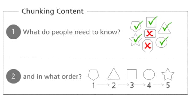
5. Create Flows
Imagine you were given the following two options to choose from:
Option 1: Checkout in 5 minutes.
Option 2: Checkout in 5 easy steps. Each will take less than a minute.
Even though both options are quite similar, most of us would choose the latter. Why? Because there’s a flow to it. You can avoid overwhelming your users by breaking down your checkout or subscription process into easy steps.
This is known as chunking — breaking a big task into subtasks.
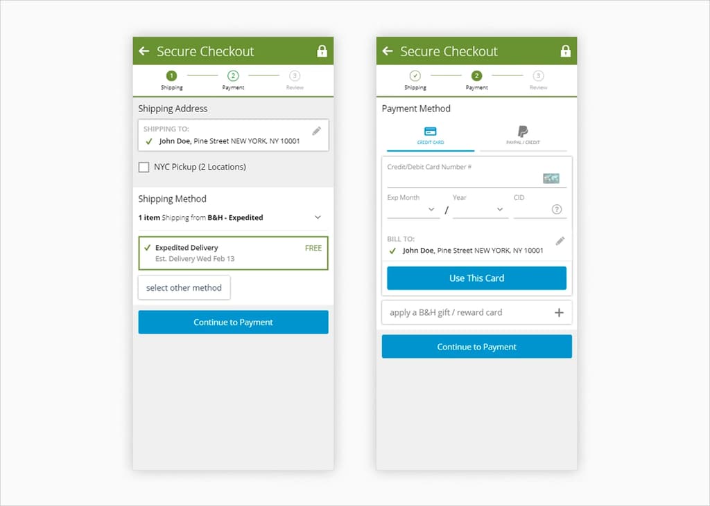
Here’s what this flow looks like in most eCommerce mobile stores – such as B&H.
6. Design for Touch
As smartphone sizes continue to increase, designers must now design for touch. Designing for touch means being aware of where users’ fingers and thumbs come to rest on a device, and designing for the world of touch screens. Here’s some things to consider when designing for touch.
- Create a thumb-friendly design layout: Many of us hold our phones with one hand, which means we use our thumbs to tap or swipe. It’s essential to design apps that do not involve finger stretching.
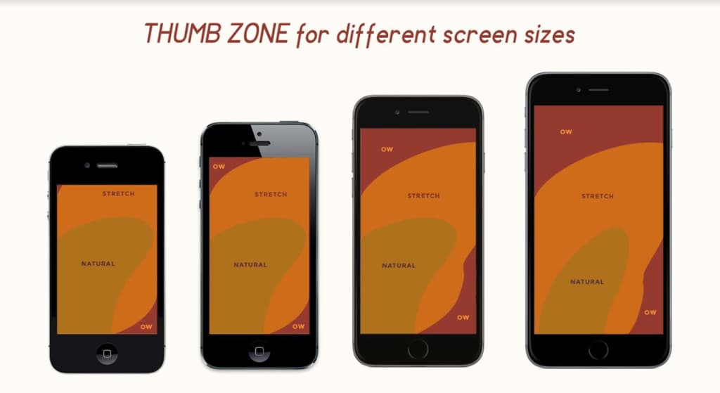
One of our favorite social media platforms, Instagram, has made use of bottom navigation where we can easily use our thumbs to navigate and even swipe.
- Make tap targets large enough: A touch target of 10 by 10 mm is an ideal size for users to easily tap the correct icon. Also, make sure that there’s enough space between multiple tap targets to avoid clicking the wrong icon.
7. Automate Tasks
If you’ve used Amazon’s mobile app to order products, you’ll know that the app saves your address details when you checkout. Saving customer details like names, emails, and addresses can streamline your users’ experience.
Other ways to decrease user effort include using autocomplete features, bookmarks or favorites, and inculcating field values to avoid mistakes.
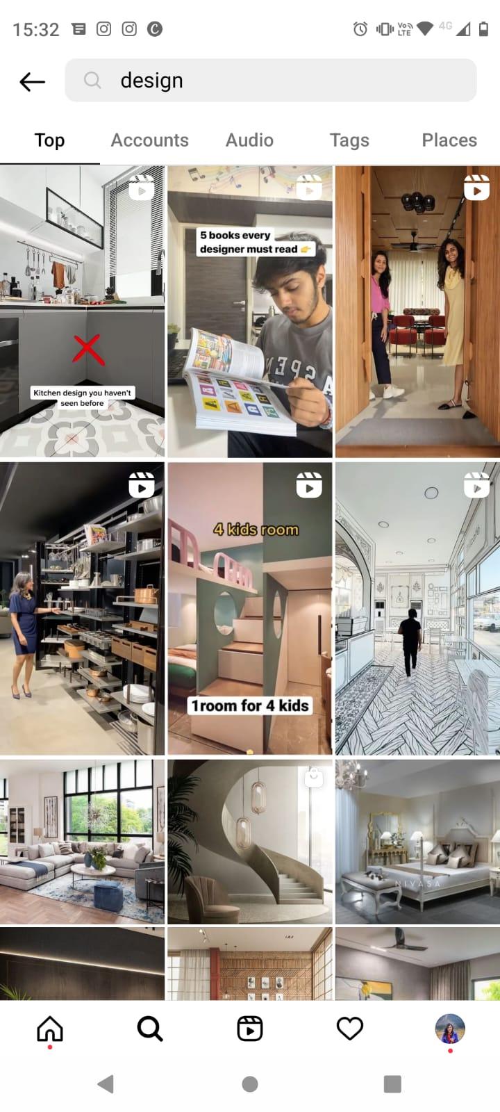
8. Use Familiar Screens
Using familiar screens can help your users better navigate and understand your app. Screens like “Getting Started” or “Search” or “News Feed” have become common templates, and follow the existing standards for mobile design. Here are some of the most frequently used screens to include in your app.
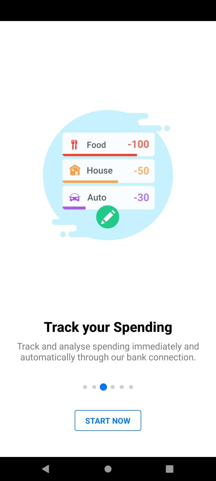
Getting Started
A sequence of screens that allow users to swipe through and get to know what they can do with the app – such as this screen from budget tracking app, Wallet.
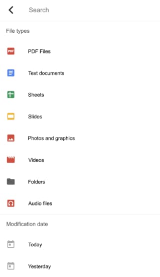
Search
Search is an important function for any app. It’s important to make your search page as helpful as possible – for example, Google Drive also gives you a list of the available file types to search from. When designing your mobile app, make sure you include the user’s recent searches as well as the most frequent search queries.
9. Make Use of Visual Weight
Not all app elements are created equal. There may be certain elements you’d like the user to take more notice of, or features you’d like them to prioritize. You can harness visual weight to highlight these elements, by making use of larger font sizes, thicker lines, and different colors.
For example, Netflix’s mobile app displays certain titles in bold or larger text sizes, followed by a “Resume” button – a CTA that captures attention.

10. Create an Inclusive Interface
Something to keep in mind when designing mobile apps is that your target audience isn’t necessarily like you. They may be differently abled – such as being unable to see certain colors or unable to understand complex features. Here are some ways you can make your app’s interface more accessible.
- Avoid using red and green color palettes, as this is a problematic color combination for those who are colorblind. Here are some other color combinations to avoid.
- Make use of gender-neutral language to avoid any bias.
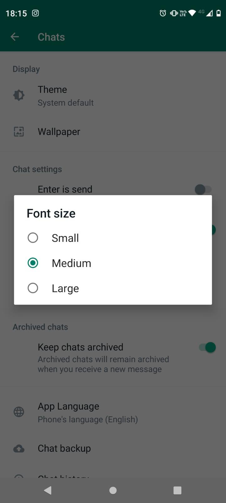
- Offer larger font sizes for people who may be visually impaired. For example, WhatsApp provides its users with various font size options.
11. Take a Step Back from Annoying Notifications
28% of people uninstall apps due to receiving too many ads or notifications. We all hate unwanted notifications, but we also love notifications that add value. It could be reminders about our upcoming tasks and meetings, or recommendations for what to watch next. When it comes to push notifications, some good rules of thumb are to determine their value, and not overdo it.
Pro-tip: Don’t send notifications at strange hours (no, we don’t want reminders of tomorrow’s meetings at 2am).
12. Test Your Design
Before launching your mobile app, demand testing your design and getting feedback is crucial. As written feedback can become easily convoluted, opt for visual feedback tools to eliminate tedious back-and-forth, or errors that could push back your launch.
Start designing your mobile app today
The world of app design is growing bigger by the day – and user expectations with it. Whether you’re planning to develop an eCommerce app, productivity tool, or entertainment app, it’s not enough to have a basic mobile app design, and the quality of the UX and UI can have a big impact on whether a user goes on to use your app, or uninstall after downloading.
While there’s a lot to consider, we hope this guide has set you on the right path to build a simple, effective app for your audience. For more on mobile app design, learn about development costs, color trends in mobile app design, as well as how to make a mobile app with Envato Elements.
Guest Author: Harsh Vijay
Harsh Vijay is co-founder of ruttl, a modern visual feedback tool that allows users to reduce the time required to collect digital feedback by 75%. He is also the CEO of Brucira, an award-winning design agency based out of Mumbai. Harsh is passionate about building product design and loves to share his entrepreneurial knowledge.