Looking for logo inspiration? From funky typography to "ugly" logos, here are the hottest logo design trends for 2023.


What’s in a logo? Logo design is an essential aspect of branding design. Your logo is often the first thing people recognize about your brand or business, and it is critical for making a good first impression on potential clients or customers. Your logo must communicate who you are and what you stand for while encapsulating your brand’s personality, purpose, and flair. Your logo should be more than just an icon – it should be nothing short of iconic. However, it should also align with what’s trending in logo design.
We’ve seen a stream of innovative logo designs emerge over the past year, ranging from dark, experimental, and edgy to stripped-back, minimalist, and vintage – with an elegance reminiscent of logo trends of the past.
So, if you’re looking for logo inspiration, you’re in the right place! From Art Deco and Art Noveau to mascots and animated morph logos, here are the top logo design trends for 2023.
1. Stripped Back Logos
With a less-is-more mentality, logos can remain relevant for years. Minimalism has had a massive impact on brand design, with more companies looking to clarify their communication by simplifying their logos.
“We’ll see this more throughout the year with large brands stripping back their logos and assets for clear communication with their target audience,” says Kristy Campbell from Pink Pony Creative. “When Sprite rebranded, the company removed the infamous spiked shape around the brand name, focusing instead on clean typography and impactful curves. The same strategy was applied to the rebrand of Burger King. We saw the design return to its roots and find itself a cleaner, stripped back, and modern approach.”
Faced with the challenge of updating decades-old logos, design agencies, and digital artists are taking a stripped-back approach and celebrating the elements that make the product instantly recognizable. Toblerone’s bright rebrand features a bespoke typeface called Tobler that runs over the edges of the packaging. It’s uncluttered yet impactful – all while nodding to the original design with a modern twist.
Another classic brand transported into the 21st century is Bugatti. While the logo’s san-serif type remains the same, the red badge has been swapped for a clean white background. Although the refresh received mixed reviews, it incorporates a logo trend that shows no sign of slowing down.
“Let’s face it, minimalist logos just work,” says Corey Dodd, Creative Director at Elk Creative. “They’re the ones we know best, and because they’re not tied to any particular design trend or era, they often remain relevant and effective for many years. Many designers subscribe to the idea that a good logo needs to be appropriate, distinct, memorable, and simple. Reducing a logo to its simplest form or idea is an enjoyable challenge for a creative person and a great approach for your customers and their audience.”
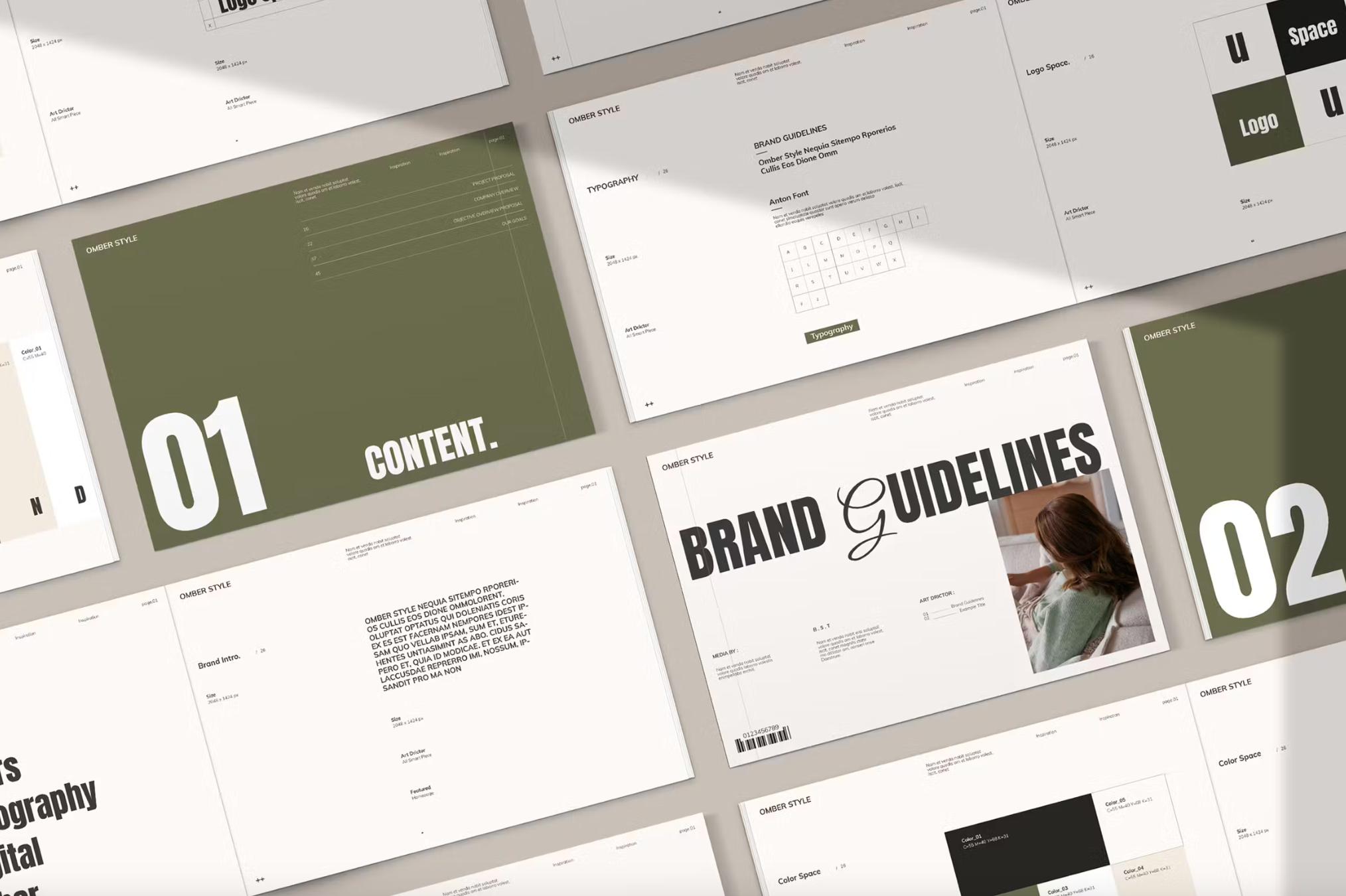
Keep things simple, from product packaging to signage, with these 50 Photoshop and Illustrator-compatible logos. Whether you’re creating a visual identity for a make-up range or a sports bar, these fully editable files feature simple icons, negative space, and easy-to-read fonts.


2. Funky Typography
Want to funk up your logo? This trend represents a highly visual approach to communicating a brand’s tone of voice, achieved through highly stylized typography and experimental lettering.
“Typography is the perfect intersection between text and graphics,” Janine from Janine Designs Daily says. “You can use your business name as the logomark with typography as the graphic element to reflect your brand and stand out. As you can see, funky typography offers a wonderful opportunity to create dynamic logos that stand out and impress customers.”
The trend takes a quirky, playful, and dynamic approach, embracing modified lettering – where one or more letters stand out and reference what the brand stands for – and inventive use of ink traps, a typographic consideration derived from the printing press. Today’s digital designers are enlarging and manipulating these pockets of negative space for a fresh take on the eye-catching anomaly.


“This trend allows brands to truly have their own unique voice and tone through only the logo,” says Kristy. “By incorporating funky, stylized typography into the logo, we see a brand’s personality shine through.”
We can see this out-there technique in Nucao‘s recent brand refresh – fitting for a company that calls itself a ‘chocolate activist.’ Its modern, curvy, calligraphy-style font oozes personality: quite a departure from the more corporate version that came before.
Whether you’re working on your portfolio or designing a new product, Tandsak is an experimental font worth exploring. Its smooth curves, expressive ligatures, and elegant ink traps make it perfect for making a statement.


3. Art Nouveau & Art Déco
This logo trend channels old-school charm and champions two defining art movements of the past century. Having influenced visual culture for over a hundred years, Art Noveau centers around organic outlines and elegant curves, while Art Deco veers towards structure, sharp angles, and geometric shapes.
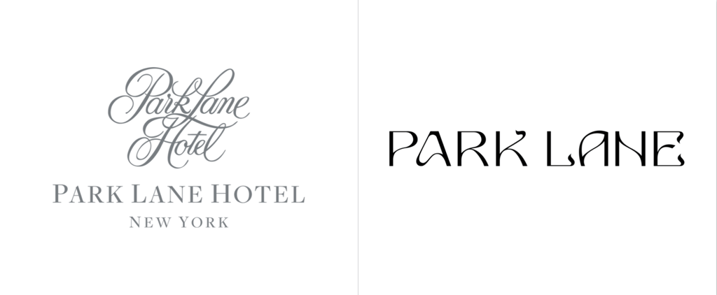
“Trends tend to have a lifecycle, and vintage fonts are definitely making a comeback,” says Janine. “Grainy textures and bold stylized lettering will be seen across businesses and brands who want to return to their roots.”
We see these elements playing out in Park Lane’s retro rebrand, showing how designers are bringing vintage fonts to life in a modern way. The New York hotel’s new typeface sets out to reimagine traditional luxury for a younger audience, featuring botanical tendrils and meandering pathways designed to reflect those found in nearby Central Park.
This brand identity by Canadian graphic designer Mélissa Phillips takes inspiration from the outside world with its wavy ligatures and leafy logo details. The project combines natural elements with a sense of yin-yang balance, resulting in some brilliantly on-brand business cards and digital assets for the nomadic naturopath brand Amelie.
Raise a champagne coupe to Gatsby-era elegance with this opulent Art Deco and Art Noveau-inspired typeface featuring multilingual characters and decorative borders ideally suited to sophisticated signage and vintage-style posters.


4. Mascots & Emblems
A great logo communicates a brand’s personality – which is why so many feature a mascot. Mascots are a fantastic way for brands to emotionally connect with their audience by presenting characters customers can recognize, relate to, and fall in love with.
“Everyone loves a brand mascot,” says Corey. “Mascots make brands more approachable and friendly by giving a business or product a face that customers can recognize, relate to, and even fall in love with. This is an amazing way for a brand to create a strong emotional connection with its audience and to show a part of their personality.”
And they’re not just for kids’ brands and sports teams: more B2B and SaaS businesses are making the most of mascots. For instance, Hootsuite’s inquisitive owl recently received a more colorful and cartoon-like makeover, making the company less corporate and more approachable. The mascot is interactive, winking when website visitors move a mouse pointer over its face.
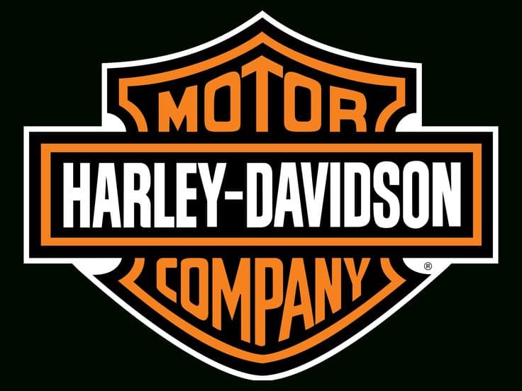
In addition to mascots, there’s been an increase in emblem logos contained within a frame or border. These create a vintage vibe by channeling old-school branding methods involving rubber stamps and wax seals. And there’s also an allusion to historic crests and insignias – just look at the shield incorporated into the Harley-Davidson logo. Intended to demonstrate strength and durability, it encourages people to view their product through this lens.
This camping logo conjures a sense of simpler times, featuring icons that complement the company’s name, a rough-textured background, and an emblem-style border. And it’s just one of many vector illustrations available via Envato Elements that work brilliantly in branding projects.


5. Swing Back to Serifs
Your brand name appears on your websites, social media feeds, advertising, and often on products, so it must be easy to read. As a result, sans-serifs have long dominated the scene, but now things are heading in an alternative direction.
“I think people are going to want more serifs in their logos in 2023 and a variety of characters used across their brand,” said Simon Lewis, Deputy Minister of Brand Design at Studio DBC.
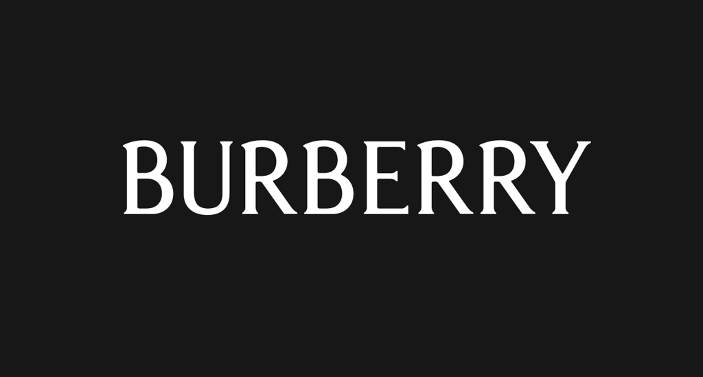
Like many big fashion brands, Burberry recently transitioned from a bold, utilitarian san-serif to a softer serif. It’s simple but with enough flourishes to stand out from the crowd.
“Sans-serifs have long dominated, but it’s now swinging back the other way,” Jacob Cass of JUST creative says. “Case in point, fashion brands like Burberry.”
Experiment with a best-of-both-world scenario by giving those serious san serifs a whimsical touch through subtle serifs, as seen in the flowing lines of the minimalist serif font Ragasta from GranzCreative, which allows for overlapping initials and looping ligatures.


6. Distorted & ‘Ugly’ Logos
While stripped-back and minimalist logos continue to monopolize the moment, there’s still plenty of room for distorted, glitched, and ‘ugly’ logos in this year’s trends. Many predict this style will become the industry standard for logo design, ensuring a brand is anything but bland.
“Yup, I said it, ugly logos,” says Corey. “I know it’s a subjective word, but I mean logos that deliberately look dated, kitsch, rushed, or not in line with traditional logo styles we know and love. Logos that appear as if they are ‘not designed by a professional designer’ on purpose. We all probably remember the brutalist website movement, which is no different. Maybe you hate this style or approach to design, but if you keep the goal of a logo’s intended purpose, it can work really well. A weird logo will stand out; sometimes the criticism is more than enough attention for a brand.”
Logos that fall into this category are intent on ripping up the traditional rulebook. They can be lo-fi or combine myriad design styles – the most important thing is to create something memorable and evocative.
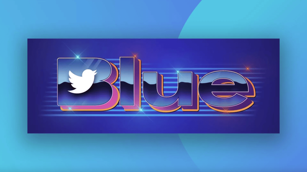
We’ll let you decide if the new Twitter Blue logo grabs attention for the right or wrong reasons – but either way, the clashing color scheme, metallic shine, and dated drop shadow demand you take notice. Many social media users have even commented that the “ugly” logo resembles noughties WordArt. Whether you love or hate it, the Y2K aesthetic is back, along with chromatic aberration, distorted lettering, and kitsch textures.
“2023 promises to be an exciting year for distorted and glitched logos as they move front and center on the logo design stage,” says Janine. “This type of logo design trend allows creative professionals to showcase their skill set while making a big impact visually. This stands out in the sea of classic minimalistic logos that can easily lack personality.”


7. Animated Morph Logos
From the erratic errors of glitch effects to seamlessly transitioning shapes, this trend is all about movement. Animated morph logos can say a lot with just a few moving elements.
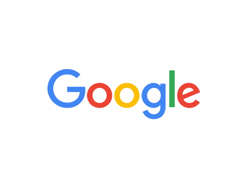
Google’s logo shows some creative flourish with icons encapsulating its suite of tools – from AI-assisted smart speakers to search. Similarly, the Google Play logo seamlessly moves through various instantly recognizable icons. Finally, Trippo’s logo transitions between a hippo and a suitcase, referencing the company’s name and travel expenses tracking app.
Make a statement with this morphing logo reveal, incorporating digital distortion and glitch elements. It’s easy to customize, so you can decide how your design should move.


8. Crafty Logos
Enhancing a logo with hand-drawn elements or illustrations can suggest a friendly, unpretentious company motivated by genuine passion and a grass-roots mentality. This trend comprises logos with layers, collage effects, analog textures, and imperfect lines.
We’re also seeing more organic shapes plastered across posters, advertisements, and fliers, such as these designs for San Diego Design Week, which substitute letters for bright geometric shapes with a crafty cut-and-paste feel. Even big tech is getting involved, with Google’s layered ‘G’ using multiple colors and shapes to represent the company’s various products and services.


Add vibrancy and dynamics to your design project with these tropical fruit illustrations. They have a distinctive DIY feel with barely there pencil sketches and outside-the-lines coloring.


That does it for the logo design trends we expect to see in 2023! For more hot trends content, check out our Graphic Design Trends and Branding Trends for 2023.